Around Here


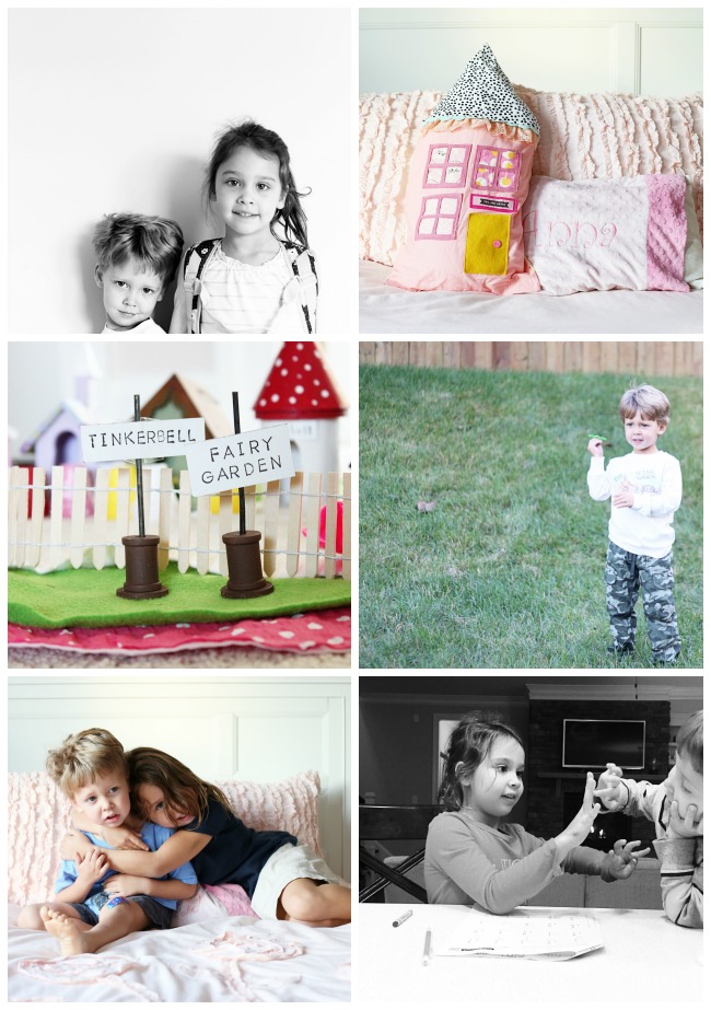
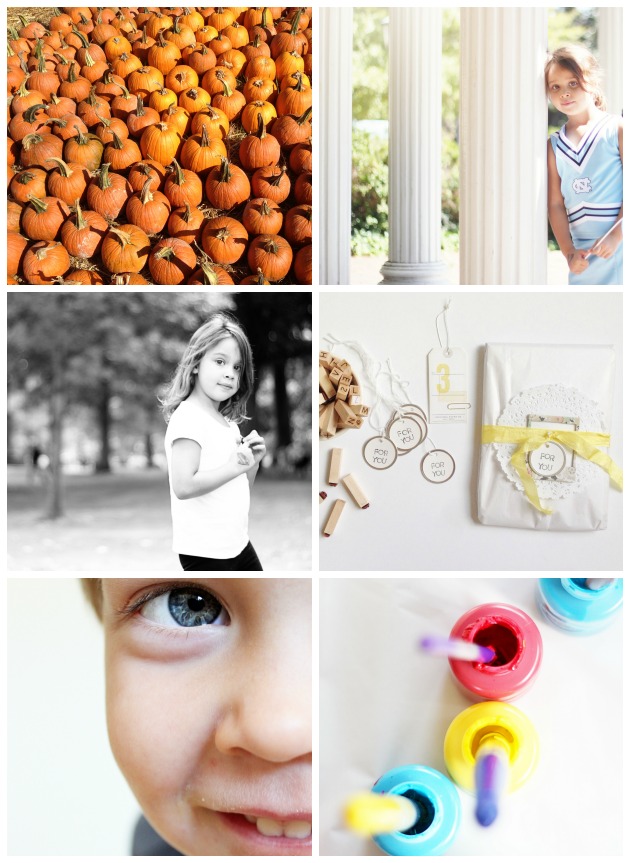
Around here it's chiiiiiilly and brrr cold, but that hasn't stopped us from going and playing outside!  Around here we are bundling up in hats and coats and scarves.  Around here we are drinking lots of hot chocolate with mini marshmallows.  Around here we are thinking everything Christmas (and the kids may have even convinced me to pull out our playroom Christmas tree!!).  Around here there are lots of art projects, watercolor and Christmas gift makings!

Happy Friday, friends!!


Creative Jumpstarts 04


Happy Monday and welcome to another edition of Creative Jumpstarts!  Thank you so much to everyone who played along with the last recipe challenge.  Recipes are always so fun to work with and you all created such amazing pages!  Marcy and I just love having you all play along with us!  

We are switching gears just a little for this next challenge and are focusing on photos this time around.  Both Marcy and myself are avid photographers and we love to capture our everyday though the lens.  We thought it would be fun to include a photo prompt to continue to think outside of the box and challenge ourselves WITH our camera in hand!

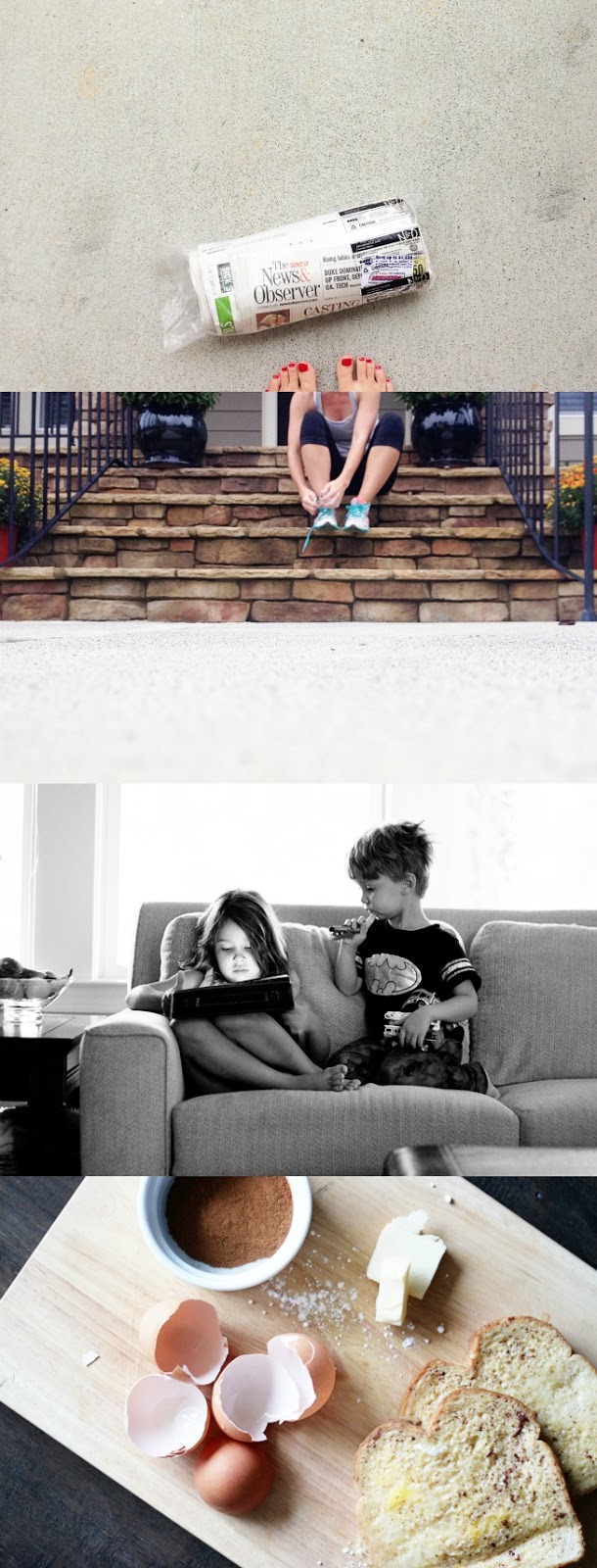
The photo prompt for this challenge is GET LOW.  Lowering your perspective can drastically change the outcome of your photo.  I think it's pretty natural to shoot photos from a standing position....we are constantly picking up our camera or smartphones and snapping photos straight on.  By taking your view from a standing position to a squating, or even laying position, you can change the look of your subject and I think the effect is amazing!

I often just set my camera right on the ground and snap away.  I love being on the same level as my children.  So, for this challenge, I pulled my camera out and decided to take several photos throughout our afternoon by "getting low".  All of the following photos were taken with my camera sitting flat on a surface (either the floor or the counter top).  I basically just sat my camera on the floor/counter and snapped away. 

Canon 6D, 50 mm 1.4, ISO 500, f/3.2

This one was taken while my daughter was being silly and rolling around on the floor.  I took quite a few from this level, but this one is my favorite.

Canon 6D, 50 mm 1.4, ISO 800, f/3.2

The above photo was taken while my kids were sitting on our kitchen island.  They like to sit up there (much to my disappointment) while I'm getting their lunch ready.  This perspective enables me to capture those sweet feet and toes. 

Canon 6D, 50 mm 1.4, ISO 800, f/3.2

This is another shot from our lunch.  Again, the camera is resting right on the counter top.  While I love to see my son making his own sandwich, what I really love is how it captures our right now....the plastic cups and plates, messy peanut butter and jelly sandwiches and day long pajamas.  

Canon 6D, 50 mm 1.4, ISO 320, f/3.2

Going along with the "get low", I decided to add in a "looking up" perspective from this angle.  It's a different look altogether, but I think it captures fun details that you don't get from a straight on photo. 

Canon 6D, 50 mm 1.4, ISO 800, f/3.2

And this last one is probably my very favorite.  This photo tells a story, and I love that by altering my camera angle, I was able to capture this sweet time.  I'm not sure if you can tell, but my daughter is practicing tying a bow.  She reeeeeeeally wants to be able to tie her shoes, but it's proven quite challenging for her.  She's also the type of person who likes immediate results, so days of practicing are frustrating to her.  From this angle, I'm able to capture her concentration (notice the tongue sticking out), as well as her sweet fingers trying to tie.  What I love most about a lower perspective is that I'm able to capture all the details that I would usually miss out on if I were shooting from above or straight ahead.


And that's your challenge for this week: grab your camera and get low! Play around with your perspective and see what photos you come up with!  If you feel up for making a layout or project with your photo, than ever better!  Both Marcy and I included our photo in an art journal.  Mine was short, sweet and simple, but it still tells so much of our everyday story!

Our next challenge will be a paper challenge and will be going up on December 1st.

Creative Jumpstarts were created by Marcy Penner and Stephanie Bryan to challenge each other with their paper endeavors. Delivered in the form of bimonthly challenges, they encourage us (and hopefully you too) to stretch supplies, think outside of the box and to remain intentional about the memories we capture.  Challenges are posted on the first and third Mondays of every month.  Projects are shared on our blogs and on Instagram using the hashtag #creativejumpstarts. We'd love it if you'd share along with us at either of those places and be sure to tag us (@helloforeverpaperco and @stephaniebryan) if you do!



Around Here


A little glimpse of our life right now....
The weather has been a mixture of hot, chilly and down right cold.  Some days we've played at the playground in shorts, and other days we stay huddled inside counting fingers, playing with our fairy garden and having dance parties to Taylor Swift's new album.  There's been lots of love and lots of hugs, as always.  We can never get enough of those!


December Daily® Inspiration


If you've signed up for the 25 Days class at Studio Calico, you probably already know that the list of contributors is amazing!!  These sweet girls are some of my favorites in the crafty world and I am so honored to have them as a part of this class!!  Between them all, they have completed 12 December Daily® albums!  That's a ton of holiday memories documented!!  I keep telling them that THEY should be teaching the class, not me!!  Each is so truly talented and today, I wanted to highlight some of their previous albums!  You can never have too much inspiration, right?


Jen is one of the very first people I "met" in this industry.  She's a sweetheart to her core and I just love her style and eye for design!  She has five years of December Daily® albums under her belt and I always love drooling over her pages.  She adds in a fun mix of watercolor, script and mixed media that always looks so amazing!!

Below is a little collage of some of her previous albums.  You can see more on here blog through the following links:

Kelly is another sweetheart and has such an eye for photos.  Her style is so detailed, but so clean.  I always feel like I could look at her pages for hours!!  Her album from last year is just so awesome.  Her simple details make each page stunning!!  


Nicole is the mini book master.  Seriously.  Whenever she posts a mini in the gallery, I squeal with excitement.  She thinks of the best uses for thickers, cards and embellishments, and I always have those "duh....why didn't I think of that" moments when looking at her work.  I actually stumbled across Nicole's blog back in 2011 after Ali Edwards posted a picture of her DD® cover on her blog.  Nicole's cover was the inspiration for my album that year and by looking at her sneak peek on Instagram, it's safe to say her cover this year might be my inspiration for NEXT year! 

Below is a little sampling of some of Nicole's December Daily® albums.  Like Jen, she has complete FIVE albums!!  You can see the rest of Nicole's work on her blog:

I loved Paige from the first second I "met" her!!  She's sweet, funny and little bit spicy...the perfect combo!!  I'm sure you all know, but, Paige is the queen of patterned papers and embellishments.  She can make magic with layers, papers and punches.  She might have only one December Daily® under her belt, but it's an amazing one!!  Her cover....gah....I just don't know what to say about it!  It's outstanding!!

Don't you love all of this eye candy??  I know I sure do!!  These designers truly are so talented and I am so honored they are a part of this class with us!!

 If you are joining us for the 25 Days class, then my foundation pages and a few tutorial videos are all waiting for you in the Classroom!!  I had so much fun prepping my pages, and I can't wait to see your pages start popping up in the gallery!!  See you there!

12 on the Twelfth: November Pictures


Another 12 on the 12th is documented and in the books!!  There was definitely nothing unusual about  our day at all.  Both kids were in school, Scott had calls all day and I hung out in my craft room.  The photo of the "Serial" podcast can pretty much sum up several hours of my day.  It's pretty boring when the kids aren't here!

Here is a look at our day on the 12th of November!!  One more month to go and this project will be complete!  I'm undecided on how I am going to tackle these photos, but I'd bet my money on some type of photo book!!    


Making a Mini


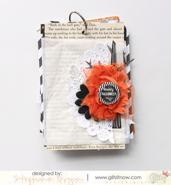
Whenever I get the itch to create and really don't have a project assignment or an idea in mind, I always gravitate towards a mini album.  I'm not sure why it's the first thing I think of, but it's kind of like my comfort zone in some since.  A layout would probably be much easier and much faster, but there's just something about a tiny little album that holds all of our memories.

  I know a lot of people say they just don't know where to start, or how to finish one!  But making a mini album CAN be easy and fun!!  Today, I thought I would share some ways I keep my mini making process simple and achievable!


1. Start with a color scheme or some piece for inspiration

The colors for my album were all inspired by the banner you see my daughter holding!!  Putting together your own inspiration board, or even collecting papers/colors that speak to you can be very inspiring!  You really don't need anything special to put together an inspiration banner either....just some twine, your favorite papers/cards and clothespins!  Easy peasy and you are all ready to go! 


2. Use your scraps

I put together this little album after preparing a layout for the Crate Paper blog.  I often find that making a mini comes so easily after the papers are already trimmed and scattered all over the place.  I swear that making the first cut is sometimes the most difficult, so if my papers are already trimmed, all I have to do is layer away!  I think it's a big plus if you already have a coordinating collection or papers that work well together too!  It kind of takes out the guess work for layers!


3. Pick a size and stick with it

This mini album is 6x6 inches and I used just one piece of 12x12 white card stock for the album base (along with my photos, which I printed out at 6x6 inches).  I alternated between a decorative page and a photo page.  Finding and sticking with a "system" definitely makes mini albums more achievable.  Don't feel like you HAVE to stick to this system!  Deviating and adding your own creative ideas is always so much fun!  Sometimes it's just good to start with a plan and then go forward from there!


4. Print your photos first

Printing is always the hardest for me.  It's just that extra step that takes time and effort when all I really want to do is create, not stop and print photos.   Printing out your photos first will be a lifesaver and will make the process that much easier!  And since you know your size, you are all set to go!  (But don't feel like your photos have to be the size of your album!  There are no rules here!  Since you know the size of your base pages, give yourself some wiggle room and print out photos that will work with your page....like 4x4 or 2x2.)


5. Add depth and dimension to your pages through layers

The photos are always my favorite part of my mini albums, but layering and embellishments come in at a pretty close second!  Having these little pops of color and texture sprinkled throughout the pages really makes the album feel more personal and handmade.  As you can see, I usually use my scraps  and layer pretty papers onto pretty papers.  


6. Create interactive elements with papers and tags

I think the interactive elements of a mini book are my children's favorite!  They love finding cards and tags and photos that slip out or flap open in our albums.  I know one day they will read little stories about our life and hopefully it will bring a smile to their faces!!  Creating interactive pages is so easy to achieve too!  You really only need washi tape to hold the sides and bottom of a piece of paper in place to create a pocket (I love to use my sewing machine!).  I think these little bits really add a personal feel to mini albums!


So what are your thoughts on minis??  Do you love them or hate them??  If you've been sitting on the fence about creating one, I hope you will jump off and give it a try!  I promise it is super easy and the end result will be a treasured item!!  

It's Beginning to Look....


....a lot like Christmas at our house.  Well....at least in my craft room, that is!  Flipping through our old December Daily® albums is priceless.  Just seeing how much my kids have changed in just the few short years I've been doing this project makes me want to continue on forever!  I love their sweet little faces and smiles.  And boy do I miss those baby days!!


I'm also in the process of getting all of my supplies ready and organized for my album.  I always tuck my Christmas goodies away, so it's kind of like Christmas day all over again when I open up my boxes and see what's inside!!  I'm mixing in my old supplies with Ali Edwards' December Daily® kit.  The kit is just amazing this year!!  And I have lots of goodies left over from her kit from last year, so it's like a double bonus (did I mention that I'm a Christmas craft hoarder??).


The registration is still open for the 25 Days class at Studio Calico and I so hope you will join us!  I've been working really hard on my pages and lots of videos, and it's going to be awesome!!  


Camping Cuties

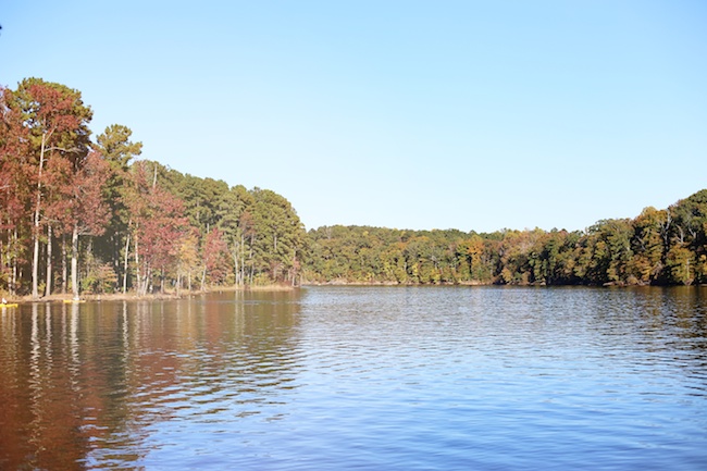
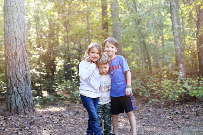
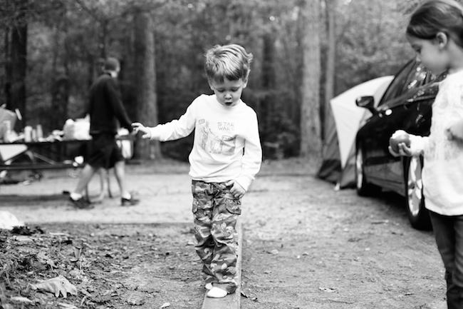
We love being outside, and when you mix in a little bit of fall with that, we love it even more!  My hubby and our neighbor took the kids out camping a few weekends ago and the weather was just perfect.  We are so fortunate to have a lake with awesome campgrounds right out our back door!!  The day was just beautiful!!  It was warm and sunny during the day and a little chilly at night.  The perfect camping weather (for them)!!  I popped in and stayed for the s'mores, but then I be-bopped back home to my own cozy bed.  :)


For you Sweet Girl


Today I thought I would share one of my favorite.layouts.ever.  Ever.

This is an oldie, but goodie.  It was published in one of the issues at Northridge Publishing, so it never made it onto the blog.  

When I started this page, I knew I wanted to create little hidden journaling and picture flaps on my page.    I always love to make layouts interactive with hidden journaling, pull out cards, etc...  so I opened up my silhouette program and started drawing boxes all over my 12x12 template.  Then I erased the top line of each box, cut out my template and was ready to go!

I covered the outside flips with patterned paper or pictures and then added my journaling and notes inside each flap.

As I worked on this page, I decided to dedicate this page to my daughter so i included lots of fun info about her.....her favorites....her personality...just her...

Here is a better look at the layout.


Do you like making interactive pages??  I love making them and usually hang these up in my room since they are so fun to play with!  Slipping them inside of a page protector just doesn't do them justice!!  


Creative Jumpstarts 03


Hey hey everyone!  It's time for another Creative Jumpstarts!  Are you all enjoying these fun challenges???  Marcy and I love love love seeing your creations popping up in galleries and Instagram!  And we especially love putting these challenges together!  It's just a fun way to think outside of the box and play with all of these pretty supplies!
The first challenge this month is a RECIPE challenge!  These are my favorite type of challenges by far.  I always find that I love the projects I complete when a recipe is involved.  And sometimes, I make up my own recipes when I'm in a creative rut just so I can make something!  Do you ever do that??

Ok, so the recipe for this challenge is:
5 patterned papers
2 brads
1 frame

You can add in other supplies, but these items MUST be a part of your layout!  Here is a look at my take on this challenge!


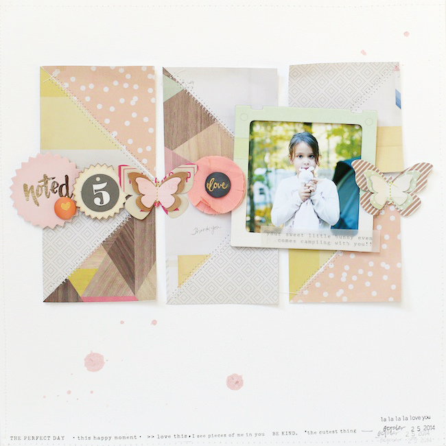
As you probably know, I don't usually go overboard with patterned papers on my pages, so when Marcy threw out "5 patterned papers", I had a little panic attack.  My typical style would be to create lots of layers under my photo, but I didn't want to do that this time around.  I really wanted to push myself to try something different with patterned papers, so I trimmed out a bunch of squares from a paper pad and started laying them on my white background.

I can't even begin to tell you how many different designs I tried out with these little squares.  I couldn't make anything work. Nothing.  So I decided to trim them into triangles and see if that would do anything for me.  And it didn't....  So...then I got this idea to create my own squares by sewing two triangles together, so that's what I did.  AND I LOVE IT!


I used a zig-zag stitch along the seam of the two triangles.  I wanted to be able to manipulate and move my edges around, and by sewing them down the middle only, I could do that easily!

I added my photo in a hoarded frame (anyone else hoarding these too??), and then sprinkled a row of embellishments to the left and right of my framed photo.  Those Crate Paper Notes & Things butterflies are just....sigh....amazing. 

My two brads are tucked into the row of embellishments....on the fabric flower and the die cut "noted" circle. 


And there you have it!  My fun page for this challenge!!  Hop on over to Marcy's blog to check out her amazing page.  It's fabulous....like always!!  

So...are you in for a recipe challenge??  
We sure do hope so!!  Be sure to link up your projects on our blogs, and use the hashtag #creativejumpstarts, as well as tag us (@stephaniebryan @helloforeverpaperco) on Instagram!!  We can't wait to see what you create!

Our next challenge will be a photo challenge and will be going up on November 17th.

Creative Jumpstarts were created by Marcy Penner and Stephanie Bryan to challenge each other with their paper endeavors. Delivered in the form of bimonthly challenges, they encourage us (and hopefully you too) to stretch supplies, think outside of the box and to remain intentional about the memories we capture.  Challenges are posted on the first and third Mondays of every month.  Projects are shared on our blogs and on Instagram using the hashtag #creativejumpstarts. We'd love it if you'd share along with us at either of those places and be sure to tag us (@helloforeverpaperco and @stephaniebryan) if you do!

The Golden Hour

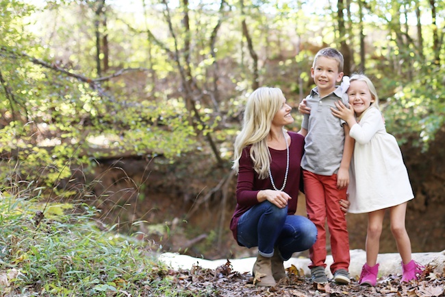
 If you've ever had your pictures taken professionally, I bet the photographer mentioned something about taking the photos at either sunrise or sunset.  There is a reason for this.  Before I started paying attention to the light throughout the day and experimenting with my camera, I never really understood why, although, I figured it had something to do with it just being too bright....or maybe too hot...   But...there is seriously something magical about that "golden hour".  The sun is at just right the point in the sky where it creates such dreamy light and beautiful glows.  It's my most favorite time of the day to snap a few photos, so I was truly honored when my sweet friend, Meredith, asked if I would take a few photos of her family late one afternoon.  I love photography something fierce....and I'm all about photographing willing participants (with my two crazy kids, I really didn't know that people ACTUALLY looked at the camera when someone asked them to!). 

I met Meredith and her beautiful family out on our local greenway in that "golden hour".  The light was seriously magical and we got so many beautiful photos of her sweet family. 


It's called the golden hour for a reason.  I totally get that now!  Go outside and check it out for yourself!  I promise you won't be disappointed!!

Disclaimer: I totally DO NOT consider my a photographer.  I am a picture-taker and a memory recorder.  

xoxoxo

For the Love of Fall & Halloween

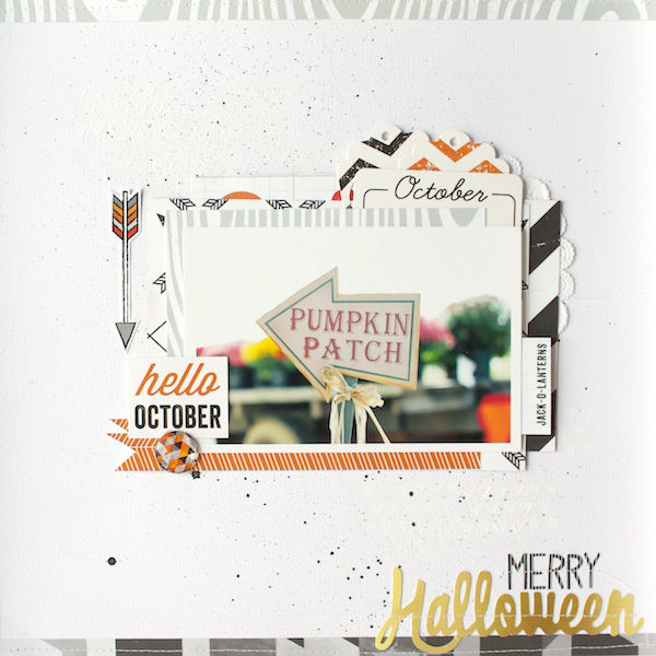
With all the fall decorations and Halloween parties in the air, I thought it would be fun to go back through my projects from last year and post them to the blog!  Sometimes I end up doing Halloween/Fall type of projects after the season, and it never really feels right posting them after the fact.  

I just love all of this projects from last year.  It's funny to see how my style has changed, but stayed so  much the same.  I obviously love white space and middle page layers.  Enjoy! :)


Week In The Life: A Look Back


Ali Edwards is embarking on her Week in the Life project again next week and I'm torn about how I want to approach this project.  I've participated in her project two of the last three years, and took some time yesterday to look back through my albums.  This project, although tedious and time consuming, is so worth it.  Just flipping through my books from 2011 and 2013 made me want to jump right in and get started.  I took two very different approaches the two years I completed this project.  I don't think I could pick a favorite.  One is jam-packed with photos, words, quotes, recipes, ephemera....and one is much more minimal and clean.  I think my "style" has evolved over the years and both albums represent my personality at that particular time.  

This is a look at my 2011 album.  I used an 8.5x11 We R Memory Keepers album and Ali's WITL digital templates.  Each day includes on large photo, small baseball card photos and one photo collage.  This book is very photo heavy with little embellishments or "fillers".  I did include a lot of words about our "daily life", and while I didn't think much about this when I did it, it might be my favorite part of the book.  I loved looking through the receipts, recipes, tags, etc.  They brought back so many memories!  I also loved all of the words, quotes and lists I included in this album. Those memories definitely fade with time and having them recorded is the best!  As you will see at the end, I used Ali's Daily Sheets, which I highly recommend.  Looking back through our timeline and daily events vs. today's happenings is crazy!


I skipped over 2012 because I felt like our days were pretty similar to that of 2011 and wasn't sure I had it in me to document a whole week.  I picked back up this project in 2013 and took a very different approach this time around.

For 2013, I decided to create ONE Project Life spread and a digital album through Artifact Uprising. I really wanted my album to be photo-heavy and really didn't want to bother with adding in embellishments or extras in my book.  Having it printed and bound was the best decision for me last year.  And I love our little book.  It's very different from my 2011 album and I love that!  So much has changed, but so much is still the same. 


I printed all of my photos in an 8.5x8.5 soft covered book from Artifact Uprising.  I love their books so much (and have printed several more since this one)!

For this book, I started with a recap of our day and one large photo, followed by a few more photos or photo collages (depending on the photos I had for that particular day).  After I had edited my photos, uploading and building this book was a piece of cake.  It took me about 30 minutes from start to finish (which is waaaaaaaay different than the amount of time it took me to do my 2011 WITL album).


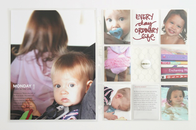
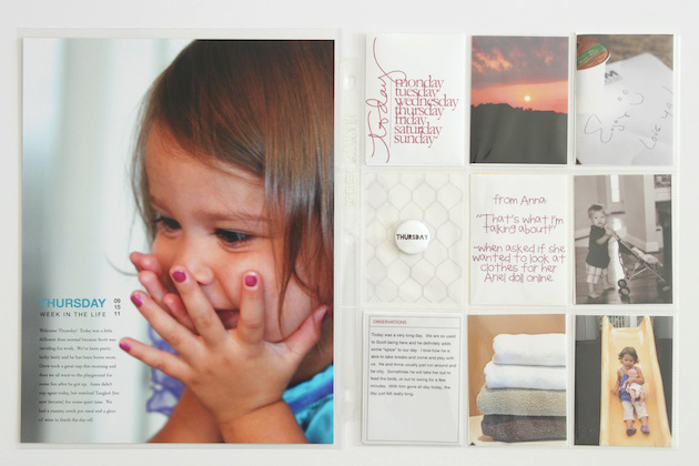
I wanted to have something a little more tangible about our week, so I put together a very simple Project Life spread.  I picked one photo from each day of the week and filled the pockets with a title card and then seven daily photos.  I used Ali's Days of the Week script brushes to add the day to my photos.  The middle row of 3x4 cards were filled with some journaling and other filler cards....basically just to make it pretty!

This spread is one of my favorites!  I just love the photos and a quick glimpse of our week!!


I'm still a little undecided on this year.  I think I'll definitely incorporate something into either my Project Life album or maybe a mini book, but I'm not quite sure yet.  I did purchase Ali's awesome WITL kit, so I do have that available.  What about you??  Are you participating this year?  Are you following Ali's lead and creating an album, or are you taking your own twist on the project??  I'd love to hear your ideas!!

Creative Jumpstarts 02


Hey hey!!  Thank you so much to those of you who played along with the very first Creative Jumpstarts challenge!!  I loved seeing your projects popping up in galleries and on Instagram!  You guys are awesome!!  And the winner of the Studio Calico Underground Kit is:   

Natalie - Such a fun challenge! I loved making my layout!
Congrats Natalie!!  We will contact you shortly!

This week, we are offering up a new kind of twist on a Project Life challenge!  


The theme for this challenge is all about pocket scrapping and the focus is on ONE COLOR!!  Marcy and I talked about it for a while and finally decided yellow should be pretty easy to use.  Yellow can be so versatile and is pretty timeless over seasons, so we thought it would be the perfect color to begin our pocket challenge!  But...you guys...this challenge was more difficult than I had imagined!!  The first thing I did was shuffle through my journaling cards looking for cards that had hints of yellow, or were yellow themselves.  And I came up super disappointed!  It made me realize that I typically begin my pages with my journaling cards and then fill in with my photos, so not having any cards to start with left me a little stumped!!  In the end, though, I just love how the spread turned out and I really love the consistency of the color throughout these pages!  Let's take a look!


I used the typical design A page protector because I already had printed several 4x6 photos that I planned to use for this spread.  Next time, I will definitely be switching up my sizes for something a little more exciting, though!  I'm kind of bored with this style right now!


After I printed the rest of my photos, I began adding them into my spread (which is different for me because, like I said, I usually start with my journaling cards).  Since the theme was yellow, I tried to print photos that went along with the color scheme, although I didn't want every photo to be yellow.   This was a super fun part of the challenge!  I loved searching through my photos for a color, whereas I usually search based on activity or event.  It's always fun to change things up a little!


For the middle cards on my page protector, I used whatever I had in various shades of yellow, as well as some patterned paper that I trimmed to fit into the pockets!  Patterned paper can make an awesome backing for smaller photos. 


I used a 3x4 die cut that I cut with my silhouette and backed the card with some light yellow paper.  I love the way the words really stand out on the card! 


I also found this cute little yellow pocket from a Studio Calico kit a few months ago and popped it right into an empty pocket with some journaling!  I'm not sure I would have gotten around to using this yellow pocket and I love that I had to think outside of the box and reach for supplies that aren't my "go-to". 


I kept the remainder of the spread pretty simple with a few light embellishments (yellow or wood veneer), and then typed up my journaling using my typewriter!!  

Once I got going, this spread moved pretty quickly!  It was the initial decision making that took me so much time!!  Sometimes it's easier to just go with the flow and see where it leads you, rather than obsess over every card and detail, right??

Thanks so much for joining me today!!  Be sure to check out Marcy's awesome take on this color Project Life challenge.  I died when I saw her spread and it took all of my will power not to copy it!!  

We hope you can play along again with this week's challenge!  Choose a color and think create a Project Life spread!  Easy peasy!
If you don't do Project Life, feel free to do a "pocket" take on a traditional layout!!  Just be sure to use just one color!!  Link up your projects here on my blog, as well as over on Marcy's blog!!  And tag #creativejumpstarts on Instagram so we can see all of your lovely projects!!

Our next challenge will be a recipe challenge and will be going up on November 3rd.

Creative Jumpstarts were created by Marcy Penner and Stephanie Bryan to challenge each other with their paper endeavors. Delivered in the form of bimonthly challenges, they encourage us (and hopefully you too) to stretch supplies, think outside of the box and to remain intentional about the memories we capture.  Challenges are posted on the first and third Mondays of every month.  Projects are shared on our blogs and on Instagram using the hashtag #creativejumpstarts. We'd love it if you'd share along with us at either of those places and be sure to tag us (@helloforeverpaperco and @stephaniebryan) if you do!

For the Love of Creative Energy

One of my favorite things to do when I finish one layout is to utilize my scraps for another (or several other) pages.  Both of these pages were created using what was left on my table after completing this and this layout.  And oftentimes, these "extra" pages are my favorite.  I feel like these pages come after I'm in my groove and the ideas flow freely.  Sometimes it takes cutting up paper or shuffling things around to spark my creative energy (which is why I usually end up creating several pages at a time with a certain kit or collection, rather than just one and moving on.).  There usually is no rhyme or reason, or really any purpose behind the beginnings of these pages (other than just to create).  And I'm totally ok with that!  Find and using my creative energy tends to come in waves and I try to grab on when I feel I'm in a groove!

For this first layout, I began by stacking up a few of the extra papers on my background.  I really didn't want to print a new photo for the page, so I used the photos I had on hand in my photo basket (stopping to print photos sometimes kills all that creative energy).  From my photos, I decided to use this one of my daughter and husband from a birthday party.  


To fill up the lower half of my page, I added this quote, which was printed on my Silhouette (you can download this one here).


The final touches were a few little embellishments scattered around my page.


The page is rather simple, but with the die cut quote, it becomes pretty striking, I think.


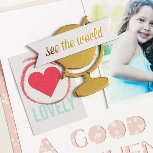
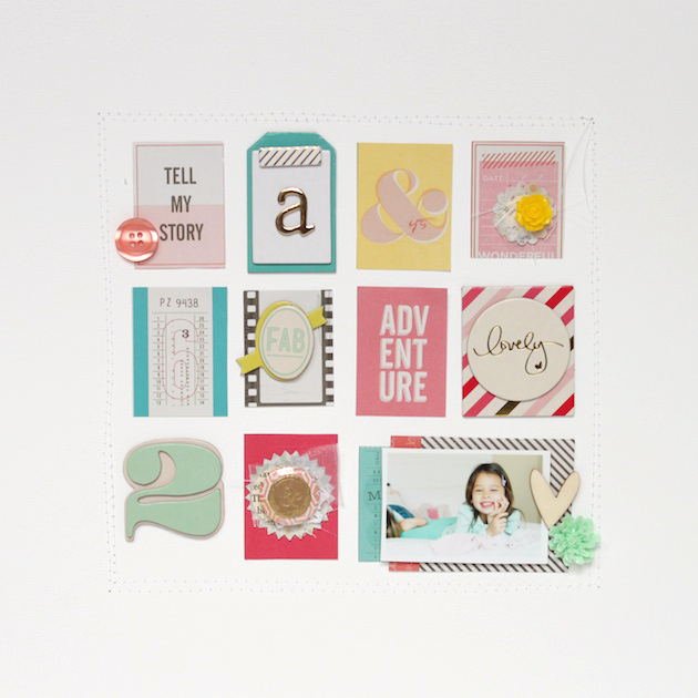
This second page is the perfect example of how I like to use my scraps!  Creating a layout using a grid design is so fun and so easy.  The idea for this page started after I cut out the "lovely" card  you see above (these were all on one sheet of 6x6 paper from the Shimelle paper pad). 


After I trimmed out the different cards, I just began laying them on my page trying to balance out the colors and hues on the paper. 


After these were adhered, I started adding in a few handmade embellishments, thickers and other embellishments on the cards.  This gives the page a little more depth and dimension.  I broke the design of the grid up a little and added a photo of my daughter (also which I just grabbed right out of my photo box) on a few horizontal paper layers. 


I felt like the grid looked a little random in the middle of the page, so I decided to quickly add a few stitched lines around the cards/photo.  This helped to ground the page and made the cards pop from the center.  


These pages definitely took more of a "creative outlet" rather than a "storytelling theme" and I'm totally fine with that.  I find that when I get in a groove, creating pages doesn't always mean that I'm telling stories, but more of an expression of myself and my creative energy.  Often I find that I start one page with a story, and then finish off with several other creative pages!  So what about you??  Do you find that once you get started, the ideas start pouring out and you just keep creating?  Sometimes starting is the hardest part, right??

As always, thanks so much for stopping by!!  Hope you have an awesome Friday!
xoxo

12 on the Twelfth: October Pictures


I am oh so glad I've continued on with this project throughout this year.  I knew I would finish it (because I am OCD and once I start a project, book, idea, scarf....I can't quit it, even if I really want to)!  Capturing ONE day during each month has been so insightful and wonderful.  I've captured moments that I would probably overlook on a day-to-day basis.  I've pulled my big camera out and toted it around with me to get the "real" shots, those everyday moments.  I love watching the months and seasons change.  I love the way the photos change, but how they still stay so much the same.  

Here is a look at our 12 on the Twelfth photos from October 12th:


Thanks so much for joining me here on my little blog!  It really, truly means so much to me!!  If you happened to play along this month, feel free to link up in the comments below!  I'd love to take a look at your everyday!

xoxo

My Take on Art Journaling: Part 4

I posted part 4 of my art journal over on Maggie's blog a while back, but really wanted to share it here so all of my pages could be easily linked together.  

I really enjoy working on this sweet little book.  It's pretty much slam-packed right now and I'm trying to decide what type of album I'm going to use next.  Maybe a Handbook.  Or I might just make my own.  Who knows!!

Ok.... so here is my take on art journaling: part 4.


Click the links below for Part 1, 2 and 3 of my art journal.  :)

And that's a look at my art journal!  Are you ready to start yours yet?  I promise you won't be disappointed!!


Hello Lovely


I was so honored to be asked by the wonderful Caylee Grey to participate in her "Hello Lovely" blog series.  I always love reading about all the wonderful creatives she invites to her blog each month and was so excited to get started on my post.  But...this assignment almost drove me to the looney bin.  It was definitely a challenge for me to describe myself using another method than typed journaling or notes.  I went back and forth and back and forth and probably made this project waaaaaay more difficult than it should have been (don't you hate when that happens???).  But when the project came together, I just fell head over heels in love with it (don't you just love when that happens???). 


On Beach Time


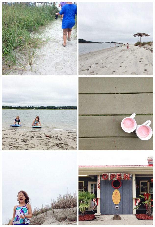
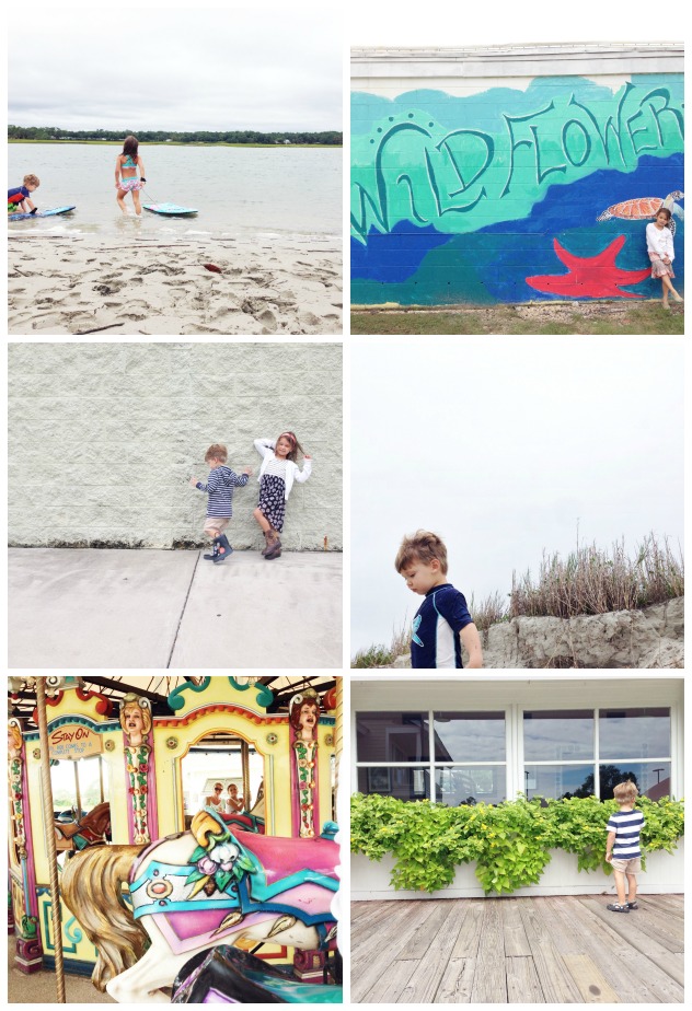
The beach is my happy place.  Even when it's raining, which it did for a most of our trip, it's still pretty awesome.  There's something about the sand and salty air that just soothes the soul and lets you breathe a sigh of relief.  We had such a wonderful family vacation with allllll of the cousins.  Family is the best.