on my desk....
lots and lots and lots of goodies on my desk.
lots and lots of ideas in my head.
lots and lots and lots and lots of paper.
you get the idea.
but...
for now i have a preschool birthday party today, a birthday party for a sweet almost four year old on saturday and easter on sunday.
lots to do.
hope you are having an awesome day!
recently....
recently...
i have been playing with paper alot.
and i love it.
i'm not sure why i never actually created scrapbook layouts before this year. it is so therapeutic for me. sometimes, though, i get overloaded with ideas and my brain seems to be on over-drive.
recently....
i have been in love with all the kits from studio calico. this month's may be my favorite. ever.
it took me a while to actually cut the paper up and use it. sometimes i tend to hoard my favorites... but with favorite papers, comes favorite layouts.
here are some of my recent favorites using this month's neverland, wendy and lost boys kits from studio calico....
i created this layout for the weekly challenge at sc. the challenge was to scrap a layout using a song lyric. this lyric "hold you so close" is from maroon 5 "daylight" and the picture of my daughter and i snuggling was perfect for the lyric. i added lots of layers of the maggie holmes "remember this" paper (using both sides) and some of the other lovely papers from the neverland kit.
again...more of the amazing maggie holmes paper. i couldn't resist cutting up one of the sentences of the paper to add underneath my photo. sigh.
this layout was for the sunday sketch on the sc blog and i chose lisa truesdell's layout as my inspiration. i love the beautiful colors of the kesi art papers in the wendy kit and they went perfect with my photos.
this layout was chosen as the layout of the week this past weekend. yay!!
i created this layout with the lost boys kit. i tend to really like grids and rows, and i love this one. the wood veneer card (something else i have been hoarding) kinda started the process for this layout. i was too scared to actually do anything to it and possibly ruin it, so i let it stand by itself. and the card to the left with the date is actually a flip card that includes all my journaling. i tend to hid my journaling if i can't quite figure out where i want it to be without standing out....
reveal is tomorrow afternoon (for subscribers) at studio calico. can't wait to see what's in store for this next month. it's always like christmas to me.
happy wednesday everyone!
color combos galore: raspberry delight
there's a new challenge up at color combos galore this week and i love the colors!
they just make you think about warmer weather and spring. two things that i am so ready for right now.
you can see the color palette below. so pretty.
and here's my layout for this week's challenge....
i chose to use the softer colors as my primary colors with pops of the turquoise and raspberry throughout my layout. i think my "pear" choice was a little off, but oh well...
i was inspired by the butterflies in photo #4....and i cut out a few with my silhouette. i added some soft colors of confetti around my photo and some of the butterflies. then i layered the pretty color palette under that adorable photo of my daughter. i added a little tag with a ribbon attached under the photo. i'm trying to get better at journaling and hidden journaling seems to be easiest right now.
hop on over to color combos galore and see all the other awesome inspiration. be sure to play along too! it's fun to raid your stash and throw together a fun layout.
playing with mists...
i love playing around with mists. you can use them in so many ways.
i created this page with lots of splatters and drawings. and it may be my favorite page ever.
the sundrifter collection from studio calico was perfect to add little bits and pieces to the page.
and those feathers..... i'm in love with feathers right now. i'm probably pretty late to the party on that one, but oh well. :)
i'm not always the best at journaling directly on my page. if i ever do have any visible journaling, it's usually done with my typewriter. i'm trying to be a little better by including my handwriting on pages, so here, i tucked a little handwritten card behind all the layers. so....it's a start, at least.
happy thursday everyone! go make something beautiful!
colors combo galore: in the navy
happy friday everyone!
there's a new challenge up at colors combo galore and i'm in love with the colors this week!
i had so much fun putting my layout together.
there's just something about balloons, a princess dress, a banner and enamel dots that make for some fun.
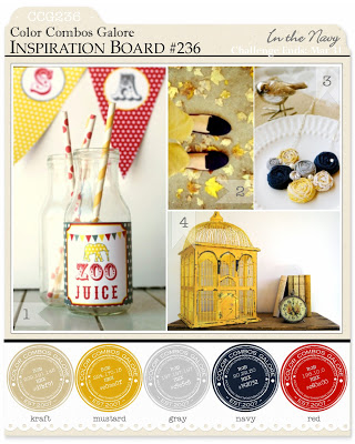
here is the inspiration board. aren't the colors awesome?
and here is my layout for the week.
i used lots of dear lizzy's lucky charm collection for this one. it was the perfect match for me. and the photo of my two sitting on the hill holding the balloons couldn't be better!!
i took my inspiration from picture #1: focus on trends (banners)...and I also some inspiration from that first picture for the polka dot paper and the enamel dots on the page.
the vintage look of the birdcage in picture #4 was perfect inspiration for the distressed dear lizzy card.
thanks so much for stopping by! pop on over to color combos galore and check out the other inspiration this week! so fun!
outdoors...
dreaming of spring...
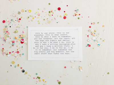
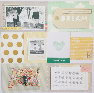
this is our story...
nicole samuels posted a challenge on her blog this week to create a layout about how your journey with memory keeping began. I'm desperately missing the daily Bright Ideas challenges at Studio Calico and I loved the idea of documenting "your story".
For me, my memory keeping journey began in 2011 with project life. i love project life (as you probably know if you follow my blog). it's perfect for recording the little bits and pieces of life. but i've also fallen in love with making layouts and documenting more memories. i do it because i love paper and stuff. and because it keeps me sane. it's my little "quiet place" where i get to be creative and dream.
but i also love having those little conversations of my children written down in one place. and ticket stubs from plays (even if they are awful).
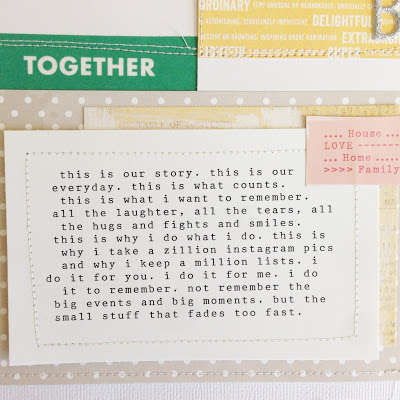
so this was layout for nicole's challenge. i created a "project life" style layout, of course. i'm loving it so much. i love how it documents "our story".
color combos galore: sweet indulgence
happy friday everyone!
so excited to post the next challenge for color combos galore.
i have to admit that i was a little stumped when i saw the color choices for this week's challenge. if you follow along with me, you probably know that my style is a little muted and that i love some white. the rusty orange had me miffed.
after starring at the challenge for a few days, i went through my stash and pulled out some corresponding papers.
i also decided that i wanted to focus on inspiration #2: frames. i cut a few Polaroid frames with my silhouette and then found some pictures to use for the layout. i ended up ditching one of the two pictures because it felt a little overwhelming to me (remember...i'm a simple girl). the other frame i added some journaling.
here's my take on the challenge...
I took my inspiration from photo #2: product (frames); with a little inspiration from photo #3 for the gold circles and script text on the tags.
i hope you'll pop on over to color combos galore and check out the challenge and other DT inspiration for this week! it's a fun one!
have a happy weekend everyone!
little black dress kit club design team - march reveal
it's reveal day over at little black dress kit club today.
i had so much fun playing with the kit this month! especially since it was my very first design team kit!
lots of beautiful dear lizzy, glitz design and studio calico. i loved both sides of the 12x12 papers, but the beautiful blues, grays and creamy browns caught my eye right off the bat!! i loved mixing them all together to create some soft, but beautiful combinations.
the a chance for luck kit has oodles of wooden veneers, ribbons and buttons. i loved finding new ways to use the veneers and buttons!
here are my layouts for this month:
i also managed to create a little mini book from a family beach trip last year. the glitz design color me happy paper is so awesome! I knew it would be perfect for a mini book cover! i'll be sharing more of the mini a little later!
be sure to head on over to the blog to check out reveal and the awesome inspiration from the other design team members
photo apps perfect for project life...
today i thought i would share some of my favorite iPhone photo apps that are absolutely perfect for project life.
i take the majority of my photos with my iPhone mostly because i always have it close by.... it's easy to tote around when we're out and about and the photo quality is actually really good. i also find myself using a lot of the iPhone apps to make my flow of project life easier.
here are my top 4 apps...which i think are perfect for project life!!
my #1...
$1.99
this app is just. plain. awesome. it is an amazing photo editing program developed my the designers of rad lab (which is a great plug in for photoshop and photoshop elements). i use rad lab all the time in photoshop so i was stoked to find this little gem in the app store. it is so super easy to use and is definitely worth the $1.99 price tag.
this app offers many different "recipes" to lighten photos, improve contrast, change to black & white, add filters, etc....
totally worth having!
here's an example of the "lights on" option
and here's an example of "lights on" and "simple b&w"
my #2....
$1.99
this app is awesome and is perfect for adding text to your photos prior to printing out. it's so user friendly and has some pretty awesome fonts.
after you add your text, you can change the color, resize and move it around to fit your picture. so perfect for project life (and instagram)!!
below are two examples.....
my #3...
$0.99
i definitely recommend the previous two first, but his one is a fun one if you like to play around with photos. it has a variety of uses......filters, enhancing photos, black & white, etc... but i really love it because it allows you to place your pictures into shapes. and the pictures look great in a project life album.
here are two examples of the shapes...
my #4...
free
this is a great app for keeping track of photos and events. it's basically a calendar that lets you upload a photo to each day of the month. i have my app set to send me a daily reminder to upload my photo and it's perfect for trying to "remember" what happened on monday that sunday when i'm putting my album together.
here's what my january calendar looked like....
there you have it. my favorites.
i love my iPhone and i love project life. and i love how the iPhone has made project life that much easier for me.
hope these help you!! let me know if you have any questions!!
xoxo
good times...
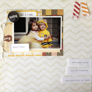
another layout for project 52 up today.
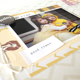
i wanted the colors of the kids yellow halloween costumes to be the focus of this pictures so i used a light background and neutral colors to help the yellows pop.
such cuties, these two.
i'm pretty sure i'm well over 52 layouts so far this year. that's pretty crazy for someone who had only made two prior to the beginning of the year.
how are you coming with your crafty goals?
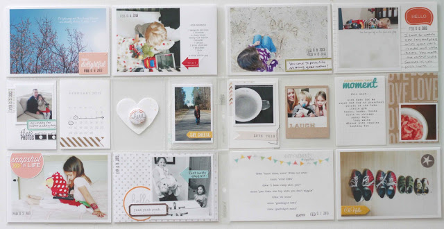
project life: week 8
another week checked off.
more memories recorded.
more funny "drew-isms" documented.
more toys photographed.
more moments remembered.
and that's why i love this little project so much.
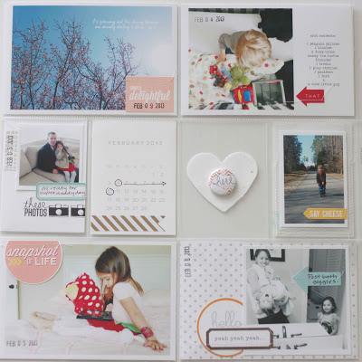
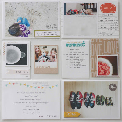
here's a look at week 8...
pretty simple, as usual.
and the left side....
and the right side...
scott and i celebrated our 6th wedding anniversary with a little trip to wilmington, nc over the weekend. he actually got sick and we ended up cutting the trip short, but i still wanted to document our time together. i created (another) insert....and....i think that i love making them more than the week's spread...shhhh.
i figured it had been a few weeks since i included some confetti so i added a confetti pocket at the top of the insert with a silhouette cut "together" sewed into place.
it's a little difficult to see in just the insert alone so i added to the spread so you could see the whole look....
and here is the front and back of the insert.
don't ya just love some confetti???
thanks so much for hanging out with me this morning!!
as always, i'm linking up over at the mom creative today. stop over if you get a chance!
xoxoxo
meet the 2013 color combos galore DT...
COLOR COMBOS GALORE FOUNDER...
Janet Perafan-Babar - USA
alongside
RETURNING MEMBERS....
Kelly Holbrook - USA
Jinny Newlin - USA
Fi Kenward - Australia
Camille Robinson - USA
AND INTRODUCING….
Beck Beattie - Australia
Emilia van den Heuvel - Netherlands
Meihsia Liu - USA
Meredith MacRitchie - Canada
Sara Noendeng - Australia
Stephanie Bryan - USA
Trudi Harrison - Australia
WITH CONTRIBUTING DESIGNERS....
Mebae Kasumi - Japan
Ana Castro - Brazil
together...
sharing another layout from my project 52.
i can't believe how many layouts i've made this year. it's been awesome.
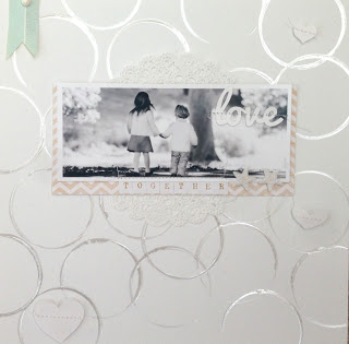
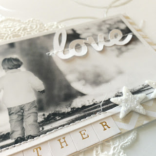
for this one, i stamped some shimmery circles using puffy paint onto a piece of white cardstock.
then i layered on a doily, some pretty papers and a super cute photo of my two kids holding hands.
i wanted to keep the background white, so i stitched on some hearts randomly around the page.
together is best, right???
freebie: circle cut file
here's another freebie for ya...
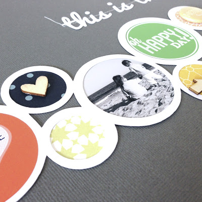
this one is a circle cut file i made on the silhouette for the layout below.
i love circles.
you could turn it sideways or on a diagonal for a different look...
and it would be super cute resized for a card...
please feel free to grab one for yourself, but please credit and link back if you use it.
xoxo
project life: layered psd template
i thought i would share a little layered template i created for my insert this week. i tend to have lots of photos, so multiple pictures on one 4x6 photo works well for me.
i also like to change things up a bit and add either journaling or embellishments on my grid pictures.
here's how i use my layered psd...
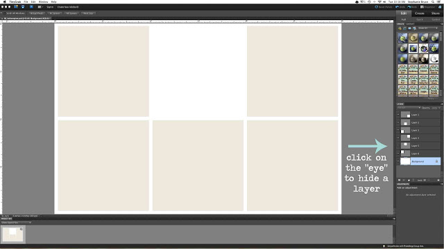
this is the file i created using photoshop elements.
you can use it as it is...with 6 slots for photos. these squares are roughly 2x2 each and are perfect for instagram photos.
when you open the psd file, you will see the layers #1-6 on the right hand side (as pictured with the arrow).
as above in my project life insert, i sometimes like to "hide" a layer to leave a white space for journaling or embellishments. for the insert, i cut down one of the dear lizzy cards for that spot and sewed it into place.
click on the little "eye" next to the layer you want to hide. you'll see that box disappear after you click on the eye icon.
for the photo on the front of the insert, i "hid" the two layers on the right to make space for my title.
i love how the white space makes the photos pop.
click below to download the layered template
let me know if you have any questions or need any help with this. i just play around with pse so i don't know too much, but i'm happy to help if i can!!
thanks for stopping by!
wonder...
i love stars.
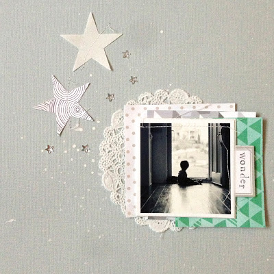
this is a simple layout i created using some paint splatters, star cutouts & star rhinestones, doily and some pattern paper.
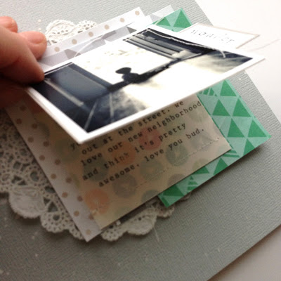
i wanted to add some additional journaling for this photo so i created a little flip up card from some card stock.
i typed my journaling onto vellum and then sewed it on top of that awesome paper from the block party kit at studio calico.
project life: week 6
i had so much fun putting this past week together. i think it's the awesome dear lizzy 5th & frolic collection that just makes me smile.
i ended up with a ton of photos this week so i decided to add an insert.
below is the spread without the insert...
i wasn't quite sure what i wanted to do with the heart (on the left side of the page), so i just punched another heart from a piece of speckled white cardstock and then added an evalicious badge on top. i love how you can see the previous week peeking through when the page is flipped...
here's a better look at each side...
photos, journaling, embellishments....
this is the insert for this week.
i'm in love with everything dear lizzy. it just makes me happy. i hoard most of her stuff, but decided to break out some of the papers, tags and stickers for this insert. lisa truesdell did a similar project life insert at two peas last year and i have been dying to do something similar. i think it might be my favorite insert. ever.
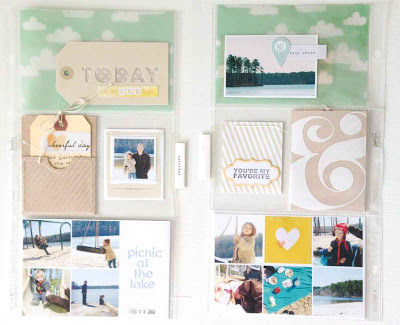
i cut down one of the design A page protectors so that i had two 4x6 and two 3x4 on the front and back. i used photoshop to create a simple picture collage since i had so many photos to add. for the collage on the front, i hid two of the layers so i could add my title. and for the back collage, i hid the top middle layer so i could sew on a little heart card.
i plan on sharing my layered photoshop file later this week so be sure to check back!
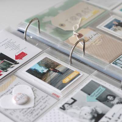
here's a peek of what the insert looks like in the album...
thanks so much for stopping by!!
and in case you missed it....i had a free laundry card download yesterday.
check it out here
be sure to hop on over to the mom creative to check out more awesome project life spreads.
