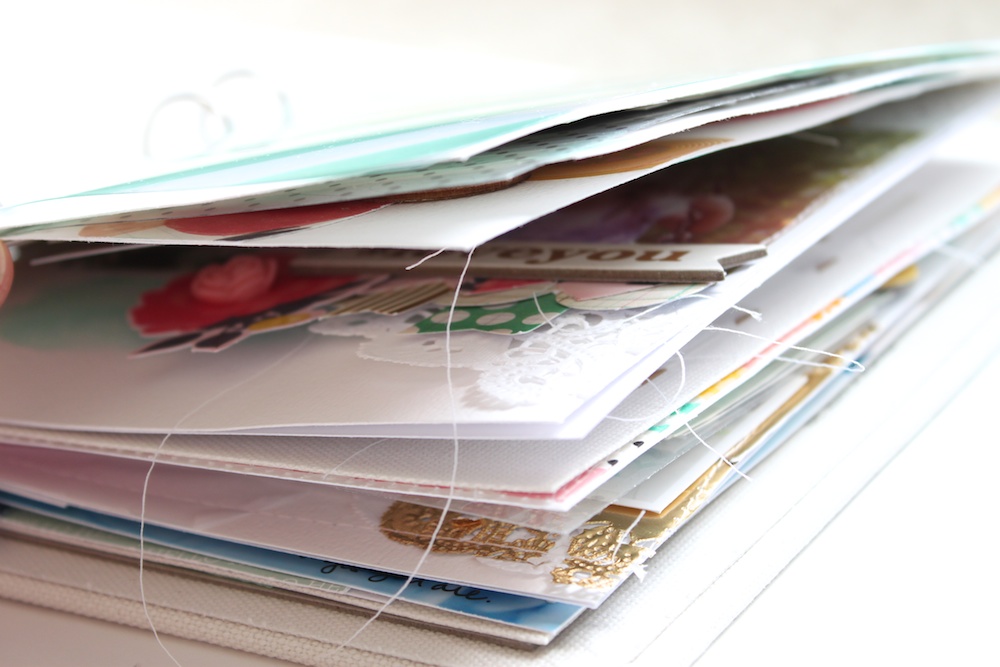
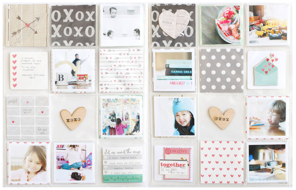
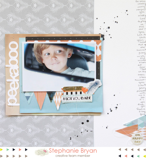
Project Life Resources

I'm a big fan of having resources right at my fingertips.  I've written quite a few Project Life related posts over the past two years and I thought it would be neat to categorize them and make them simple to find.  You can obviously use the labels on my sidebar, but again...I like convenience and if it's right in my face, I'm more likely to click it.  :)

I plan on adding all my future posts to the correct labels, so these links will continually be updated.  Just click on the link below each image to be taken to the corresponding posts.  There are several posts per photo, so be sure to scroll down for more inspiration!!  I hope this is helpful!!


You Color My Life Beautiful...

 It's safe to say that I just enjoy creating.  I love having assignments and deadlines and projects to work on.  And when I don't have any of those lined up, well...then I just make up my own challenges and play along with challenges from some of my scrappy friends.  

Yesterday I shared my layout from Marcy's Jumpstart challenge.  I love the way it turned out and am inspired to play with my scraps more often.  

My sweet friend, Wilna, shared this cut file freebie a week or so ago and I couldn't wait to use it.  I wasn't sure exactly what I wanted to do, but I loooooove the way this page turned out!!

Here's a look at my layout..


I started by cutting out my title on a piece of 8.5x11 white card stock.  I typically always cut on white because it just makes it an easier starting point.

Next, I was inspired by the title and added some watercolors to my background.
From there, I played around with the placement of the cut file trying to figure out what photo I wanted to add with the title.  Then I remembered I had these extra photos I had printed for my Two Peas Project Life spread last weekend and knew they would be perfect for this page!!  The photos are of my daughter and her sweet face from the last year.  I just love looking at them all on one page and this is by far my daughter's favorite page. Ever.


I used pop dots to adhere my title to the page to add a little depth and dimension.  So flippin' fun!!


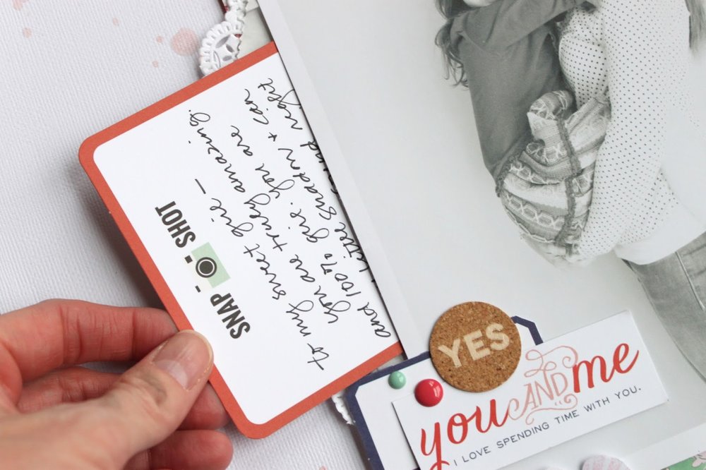
Since the title was so bold, I scattered a few smaller embellishments above and below just for added interest.  I also typed up a little note to her and added it at the bottom of the page.


Be sure to visit Wilna's awesome blog and shop for so much incredible, amazing inspiration!!  She's one of the most talented, artistic women I know!!

For the Love of White Space...


It's no surprise that I'm a big fan of white space.  I love starting with a blank white page and adding paper layers, colors, photos and embellishments.  Embellishments are my favorite and I think a white canvas lets you add as may embellishments as you would like!  

This week at Glitz Design is all about white space.  And I took this challenge very literally.  When I started my layout, I knew I wanted one photo in the center of my page with very soft embellishments at the bottom of my photo.

Here's how it turned out...


I added a small piece of mint green washi at the top of my photo just to break up the top whiteness a little.  A small sticker, heart and date stamp adorn the bottom of my photo, again to break up the white and ground my photo.

I could have added a few paper layers, or even more embellishments, but I really wanted to take a minimalistic approach to this page.  Sometimes a photo is all you need.  :)


Challenge: Using a Large Title


Thank you so much to those who played along with my last Recipe Challenge!!  Recipe challenges are my favorite!  They are easy, fun and take all of the "guesswork" about what to use out of the equation!

Check out all of the lovely projects.  I love how everyone has a different take on the recipe even though the same types of products are used!!  

(Listed from left to right)


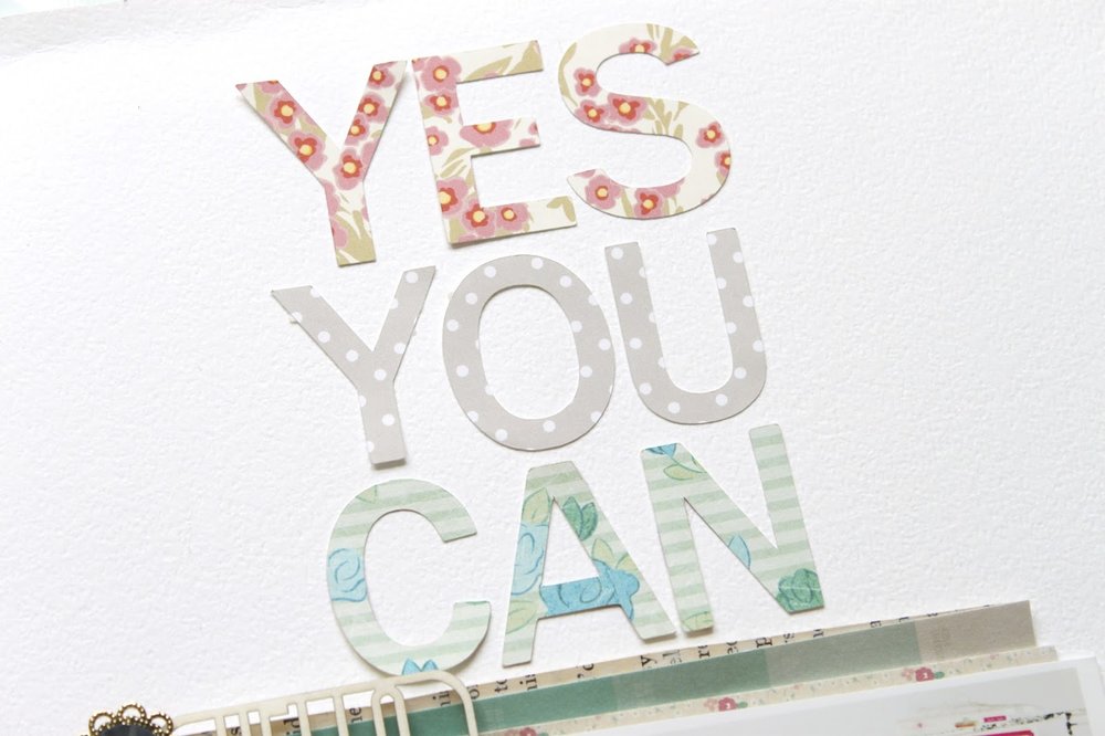
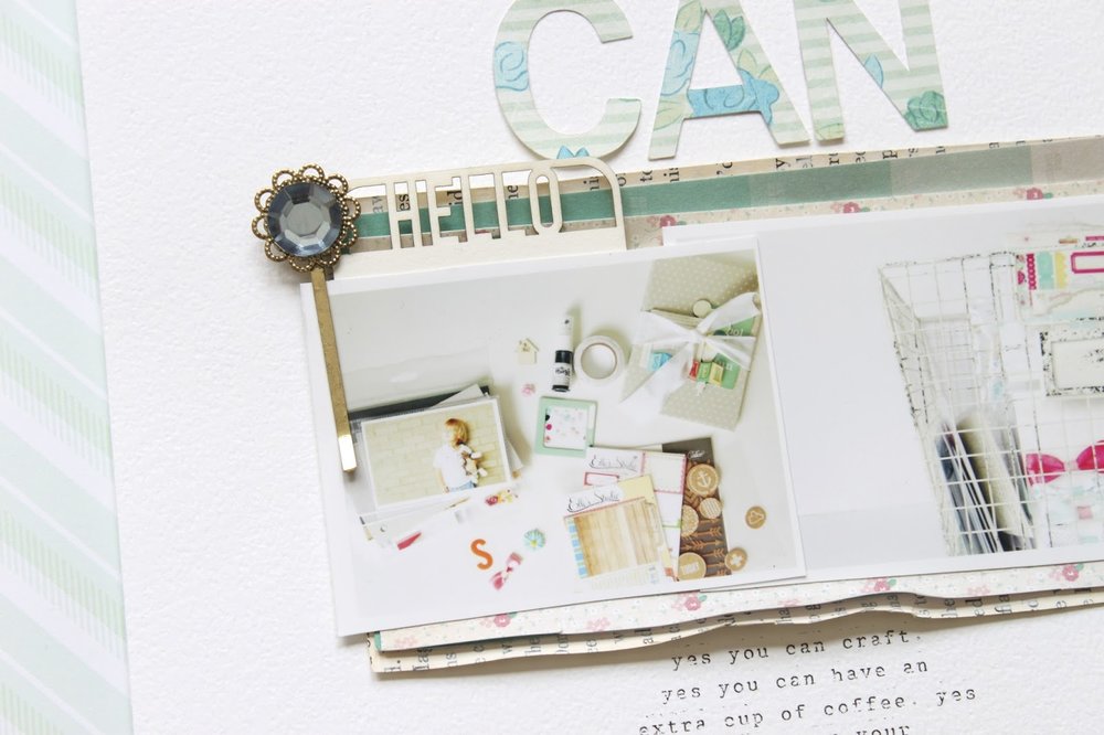
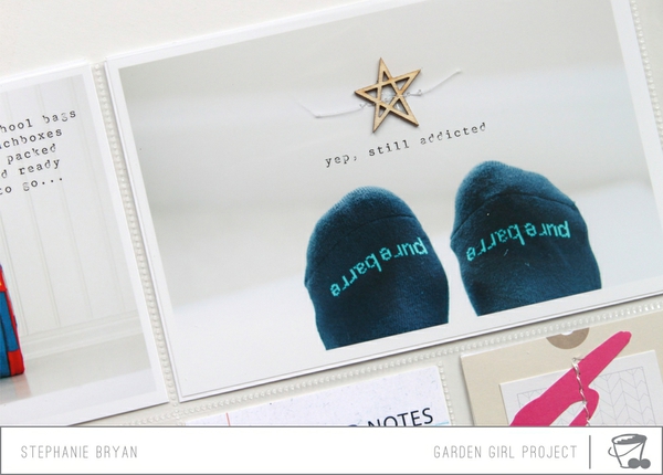
My next challenge for you is to use a large title on your project.  My layout below all came about because of the three words "Yes You Can".  I hear these words in Pure Barre all of the time and they usually resonate with me all day long.  One day when I was feeling crafty, I thought about allllll the other things I should be doing (think: laundry, cleaning, planning dinner).  My kids were in preschool and my husband was out of town.  I had the house all to myself and all I really wanted to do was create (which is all I really ever want to do).  So I thought to myself "yes you can"...and so I did!  :)

I started by cutting out my title from a few of my favorite patterned papers and then grabbed out a few photos and embellishments.  I wanted my title to be the statement of my page, with the photos more of an afterthought.  Usually my photos speak the majority of my story, but today, these words are what I wanted to convey on paper.  

I used two "crafty" photos that I had in my photo box.  Really anything could have gone here....so I just used what I had available.  A few simple embellishments, some journaling and my page was done!

Here's a look at my finished page:


Super simple page, but the words speak volumes to me.  I have this page sitting up on my desk to remind me that the little things can wait....  :)

What about you??  Can you think of a title that resonates with you or your life right now??  If you are up for a challenge, I would love for you to play along!!  Anything goes....just as long as you use a large title!  Get creative and have fun!

Please link up your projects here and tag me on Instagram .  
There isn't really a "deadline" per se....just link up when you can!!  Can't wait to see what you create!

Happy crafting!  

My Take on Art Journaling...Part 2


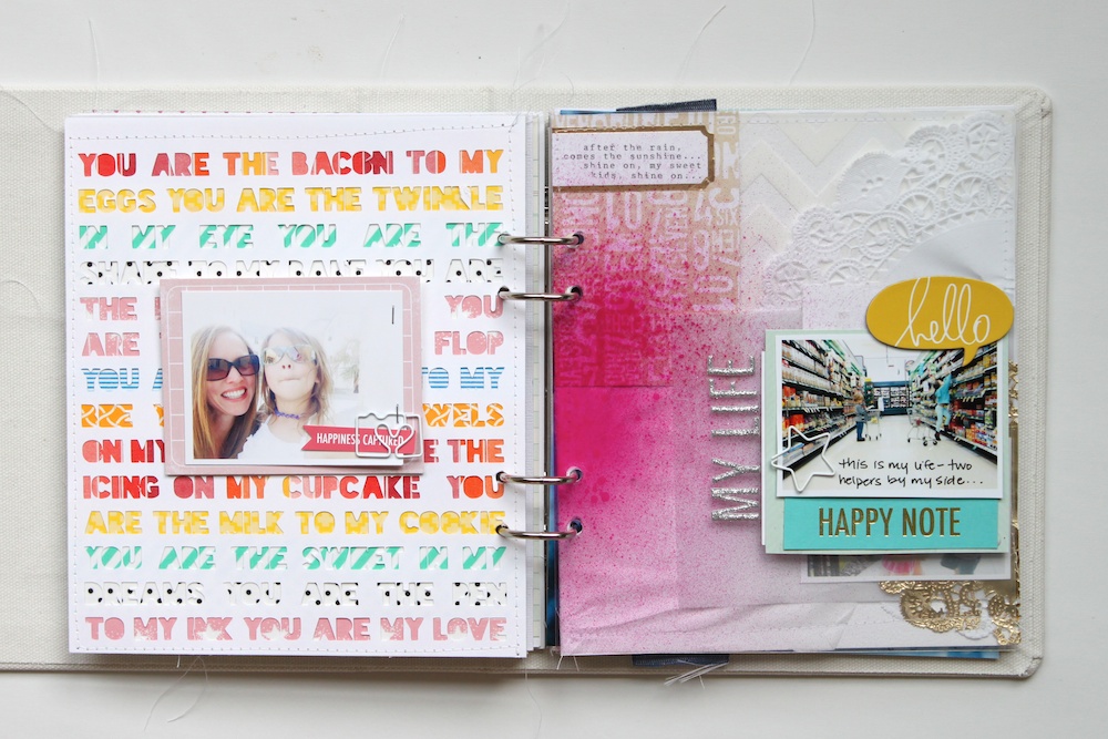
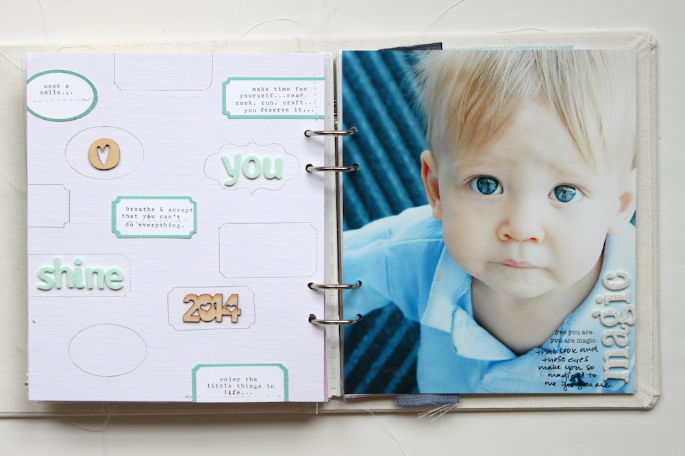
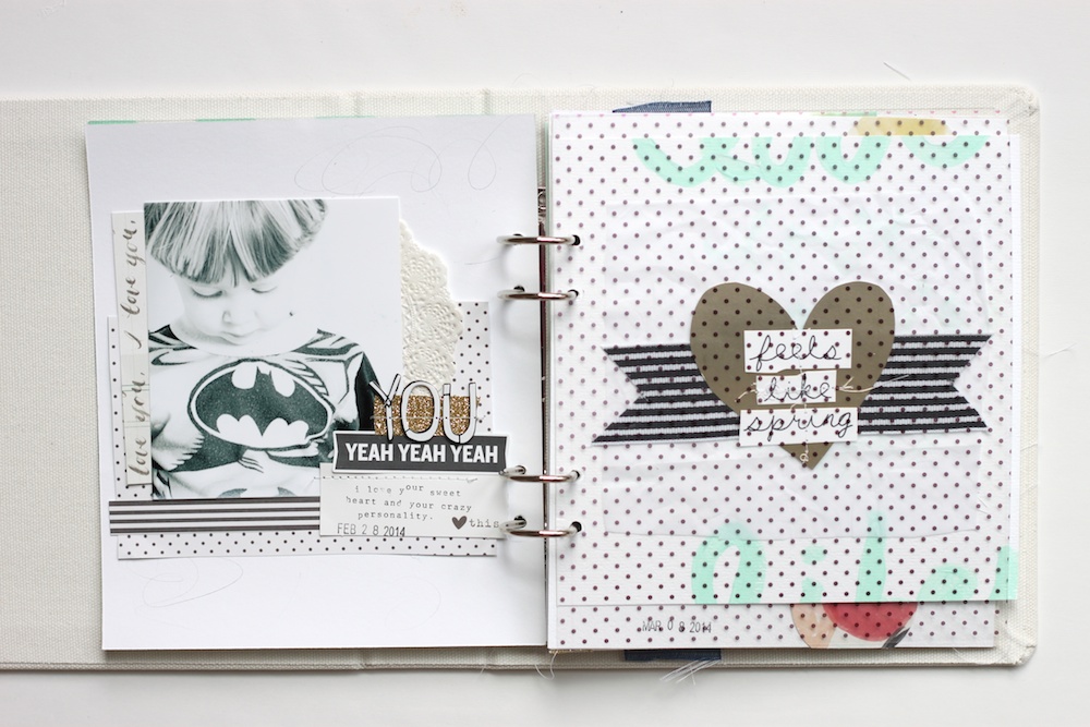
This art journal is my new favorite project!  I love the look and the thought behind each page.  It remind me of my mini albums in some ways.  My take on this art journal has continues to have more of a "scrapbook" approach and I am totally fine with that.  It continues to shows my style....lots of white space with fun pops of color throughout.  It's simple and beautiful (to me) at the same time.  

Although I create many pages, Project Life spreads and mini books, this journal has a totally different feel to me.  It's a place where I can get down exactly what I'm feeling right at that moment.  I don't have to worry about the supplies I use or trying to make it a certain way.  I just create and that's very freeing and exciting.  Some days I will make a few pages in my journal...and some days I will make one that is super personal to me or for my children.  It's a little place where I can write notes to my kids, myself or my husband.  It's "my" journal and I just love it.

Today, I wanted to share a few more pages of my art journal, as well as a quick little video walking you through my book.  You can see images of the first pages in part 1 of "My Take on Art Journaling" here.


Anyone else currently taking the class at A Beautiful Mess?  If you've posted your album on your blog or in a gallery, leave me a link! I would love to check it out! 

12 on the Twelfth: April Photos

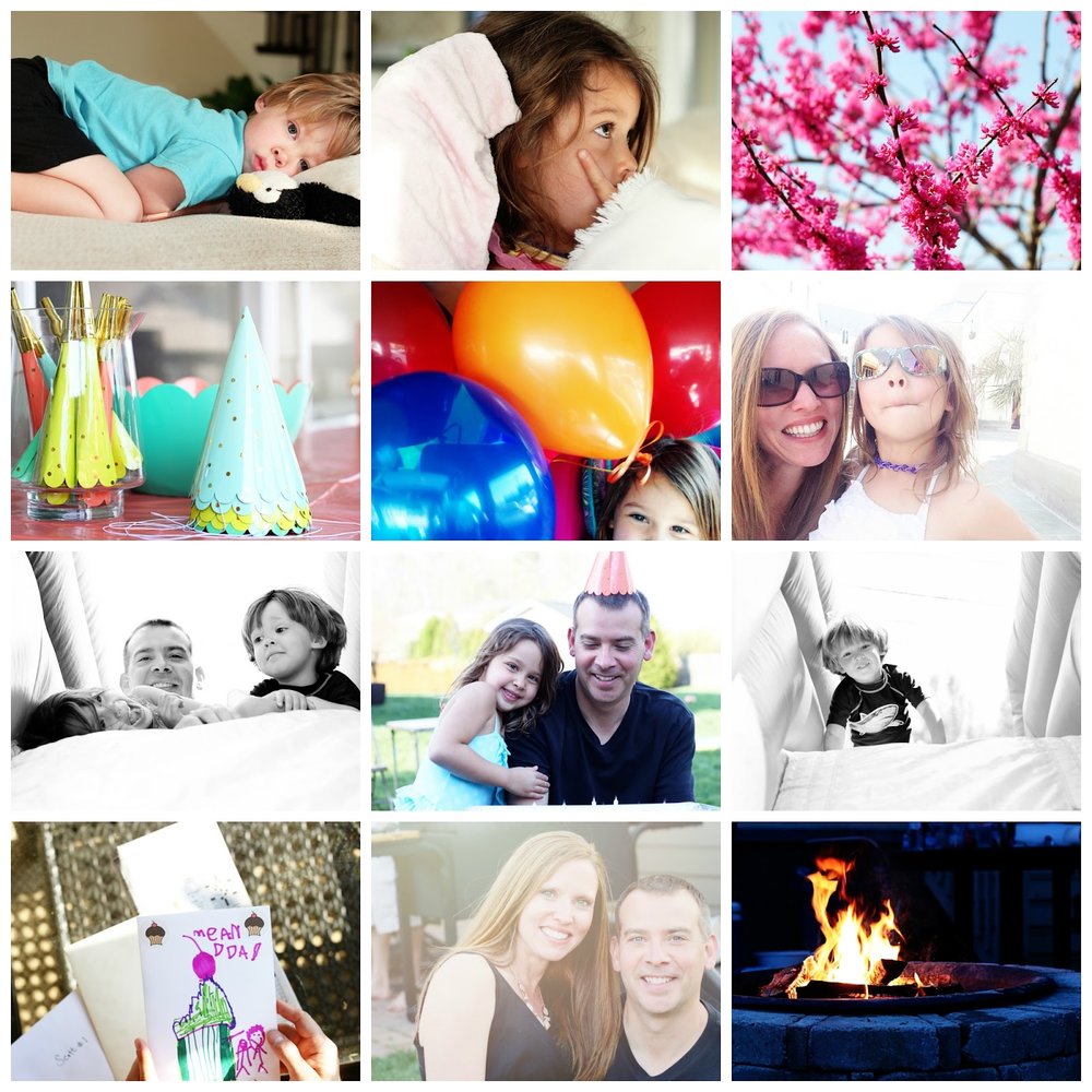
Another 12 on the Twelfth is in the books!  I'm still quite shocked that I ended up with 12 pictures from today!  I  started off strong, but the to-do list quickly got in the way of my camera.  I feel like the photos totally capture our day, though.  It was all about my husband and a party.... 

I ended up with way more "subject" photos than I'm usually get, but I love the emotion and happiness that is captured from today.  It was a good day.  Good food, good fun, good friends and good family.  Really, there's nothing better.  

Here's a look at our day...


If you were able to play along, I would love for you to link up your photos!!  And if you missed today, pick another day and then link up.  There are no rules with this fun project!!  Happy snapping!

12 on the Twelfth...April

Today is the 12th of the month and that means it's time to grab out that camera!  As much as I feel like the 12th pops up right after the 1st of the month, I really do love this little project.  I wasn't exactly sure if I was going to go through with the pictures this month because today happens to be a super busy day for us.  It's my husband's birthday and we've invited all of our neighbors and friends over for an outdoor party, so you can only imagine what all needs to be done....  But, I started looking back through my Project Life spreads of my 12 on the 12th photos and they just warmed my heart.  I love the random photos I've snapped of our day and I love how they really do speak to our everyday.  I think my "everyday" photos have fallen a little short this year since I've switched to a monthly approach and don't really worry when I take my photos.  I'm super happy with the monthly approach, but I love that I have the 12 on the 12th photos.  I love that glimpse of our lives.

So, heck yeah, I'll have my camera out today!  I hope you will join me if you have time!  It really is fun to do, and there is no pressure at all.  You don't have to get 12 photos and they don't have to be today.  It's just a fun reminder to play around with your camera and capture your everyday!

I'm not sure if I will have my photos up on Sunday, but we shall see.  Feel free to link up your photos in the comments section here if my photos aren't up and a linky isn't up!!  Can't wait to see your day!

You can click the links below to be taken to my January, February and March photos.


And I thought it would be fun to pull the Project Life spreads that I made with these photos.  This is by far my favorite part....getting them off of my camera and into my album.  I've linked up each page below if you would like to see more photos or find out how that spread came together.


Glitz Design Inspiration

Happy Friday!  I have two new Glitz Design projects to share with you today!  Things have been so out-of-control crazy, I haven't even had time to post them yet.  I'm room mom for both my son and daughter's classrooms and it's been "cray cray", if you know what I mean. 

Anyhoo...on to the layouts. 


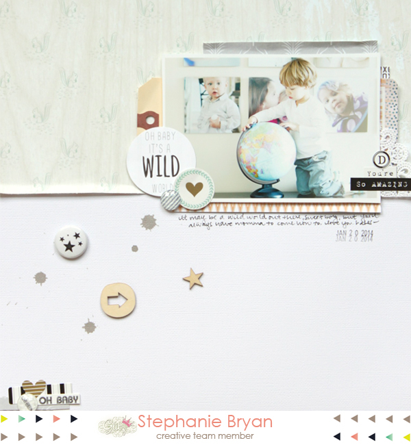
This first one was made with the new 77 collection.  I really wanted to go with a bold background on this one and added a piece of patterned paper to more than half of my page.  Then I layered on my photo, a few trimmed triangles for accents and added my journaling down the right hand side of my paper. 


Song lyrics and music is the theme at Glitz this week, and I drew inspiration from the "Oh baby it's a wild world" card.  I kept the main focus of my layout at the top of the page and used the "Squirrels" paper from the Carpe Diem collection to break up the white space.  

Be sure to visit the Glitz blog for more amazing inspiration from the Design Team!!

A Recipe Challenge


I love challenges!  I love having a starting point or some type of direction when I have new supplies or photos to play with.  I'm always thinking of different techniques to try or fun ways to put my photos to paper!  It keeps it exciting and interesting!  And my very favorite part of challenges is sharing them with you and having you all play along with me!!  A great big thank you to Anita and Julia for playing along with my last challenge and linking up your layouts!!  Check out their awesome layouts below!!  If you have time, click on over to their gallery page and leave them some love!!


Since it's Sunday and I have an itch to create, I decided to create a little recipe challenge as my starting point.  I love knowing exactly what to use on my page.  Now all I need to do is move paper around and get creative!  Even if I'm not playing along with a challenge, I will still make a recipe for myself.  Sometimes lots of pretty supplies can become overwhelming for me!  Narrowing down what I want to use keeps it light and fun....just the way it should be!


Here's the recipe for this challenge:
Five patterned papers
Two photos (not pictured above)
Two different alphas
One flair
One wood veneer
Book paper

Here is my take on this challenge....  I was really feeling circles today, so I went with it.  Circles are so fun and easy to play with and can be quite eye catching.  I used a small and large circle punch for my patterned papers and photos and then just played around with layering them.  I added in the book paper too for a little bit of contrast.  I had a harder time with the alpha since I wanted my title to fit inside of one of the circles.  In the end, I used the Studio Calico Cork Alpha stickers and some smaller Basic Grey for my title.  


And that's it!  Grab your photos and supplies and get crafty!!  I hope you will play along!  Challenges are always more fun with friends!  Be sure to link up your layout here in the comments section so I can see your work and feature your layout!!  And if you happen to be on Instagram, you can tag me there (@stephaniebryan).  Can't wait to see what you create!!

Project Life: March 2014 (Part 2)


I have a new Project Life spread up at Two Peas today.  This spread is the continuation of the 12 on the 12th photos that I shared last Saturday.  I wanted to include all 12 photos as a 4x6 so I added in an insert that has 3 4x6 slots on the front and back.

For something fun and different on this spread, I used applied the Dear Lizzy Daydreamer rub-ons directly onto my photos.  I love the pop of color they add and how the act like digital brushes!  Have you ever used rub-ons on your photos?

Since I added one journaling card explaining these photos, I didn't really need to add much more journaling for each photo.  Anything I did want to add, I typed onto the Studio Calico labels.


Happy Saturday!


Project Life: More March 2014

Today, I wanted to share another one of my March Project Life spreads.  I used the Gossamer Blue April kits to put this spread together and I think it's one of my very favorite from this year.  I was really craving white space and order when I created this spread and I think that's reflected here.  It's funny how our moods dictate how we scrap....at least for me anyway!  


I'm still keeping with the 4x6 photos for my larger pockets.  It keeps it super simple when printing photos out and takes all the guesswork out of what size photos to print.  I did include two photos on one 4x6 picture, as you can see on the right hand page.  Easy peasy.


This spread covers a little getaway my husband and I took for our anniversary.  I included a few pieces of memorabilia in this spread.  I need to that more often.  I love the little glimpses of "real life".  


The journaling cards are part of the Gossamer Blue Add-ons and were designed by Peppermint Gransberg from One Little Bird.  They made my heart go pitter-patter.  So soft and beautiful! 


Sometimes the simplicity of Project Life shines through.  And it really should be something simple.  I love to mix things up and challenge myself every once in a while to keep it fun and interesting, but keeping it "simple" reminds me of what Project Life is all about!  

Happy Wednesday everyone!! 


5


This little lady has been counting down to her birthday for months.  She's been dying to be five and that day is officially here!  Happy happy birthday to my sweet and spunky little lady.  Momma loves you more than words could ever describe!!


Project Life: March 2014 (Part 1)


Happy Saturday!!
I have one of my March Project Life spreads up at Two Peas in a Bucket today!  This is actually Part 1 of my 12 on the 12th photos.  I decided to add each photo into my album as a 4x6, so I ended up with two Design A pages and one insert.  I love the way it turned out.  Adding smaller pages and inserts is my favorite part about my album this year!!


My take on art journaling...


I'm taking the 52 weeks of Art Journaling class with Rachel Denbow over at A Beautiful Mess.  I've always been drawn to art journals and the like, but I have never created my own.  It's taking me a little while to find my comfort zone and get out of the "scrapping" mode.  I think most of my pages still reflect my typical style....white space, light colors, small patterns.  But creating these pages is very different than creating a layout or mini album (to me, at least).  I try not to overthink it.  I try to go with whatever idea I have when I start out the page.  I even include handwritten journaling (gasp...that's big for me!).

The lessons and prompts with the class are great inspiration and I just love looking at the artistic approach many of them take.  Sometimes I'm inspired by the lesson, sometimes the prompt, and sometimes an idea pops in my head while I'm out and about.  Or right before I go to bed.  (Most of my ideas seem to settle in right before I fall asleep.  Anyone else do this?)

Today, I wanted to share the first few pages of my art journal.  And remember...this is my take on "art".  I want to include more paint and make a bigger mess in this album, but finding my comfort zone is taking time.  For now, you will see lots of white space and pops of color...  Big surprise, huh?


Do you have an art journal or some type of book that is just all yours?  A place to experiment and create without boundaries?  


Using large photos & a challenge


The kids were snuggled in on the couch this weekend watching Frozen for the zillionth time, so I snuck away for a few moments in my craft room.  I love to create, but printing pictures is my least favorite thing.  I do have a little box where I keep extra photos that haven't been used yet, but I flip through those so often I'm kinda tired of seeing them.  As I was looking for something to use on a project, I found two photos of me with my kids that I had printed on a piece of white card stock.  The photos were a little bit larger than I would normally use, so it was fun to play around with paper and photos in a different way.

I challenged myself to create two layouts...one for my daughter and one for my son using these two photos.  I used the Office Hour Scrapbook kit and Project Life kit from Studio Calico to put these together.  The least amount of options, the better for me.  I can sometimes get lost in paper and embellishments if I'm not careful! :)


I thought it would be fun to offer this up as a little challenge with a fun prize on my blog today!  I'd love to see your take on this project!

It's super simple to do and you really only need a printer and some paper to make it happen!

Here's a quick little walk through....
Start by printing two photos onto a piece of 8.5x11 white card stock.  I used Aperture to print my photos by choosing the "two photos per page" option.  Play around with your printer settings and try to get two large photos on one page.  If you would like to Photoshop to layer your photos, I put together a little template for you to use.


After you have your photos printed onto one page, just cut right down the middle for two large photos.  Now it's the fun part!  Get those photos and stories onto a layout!

Here's my two layouts!


I used some papers from the Office Hours Scrapbook kit to create a base for my photo.    I sewed my photo onto a piece of printer paper so I could add my journaling under the photo.  I filled in the bottom part of my photo with this awesome cut file created by Paige Evans.  A few embellishments, cork stickers and a trimmed journaling card finished off my page.


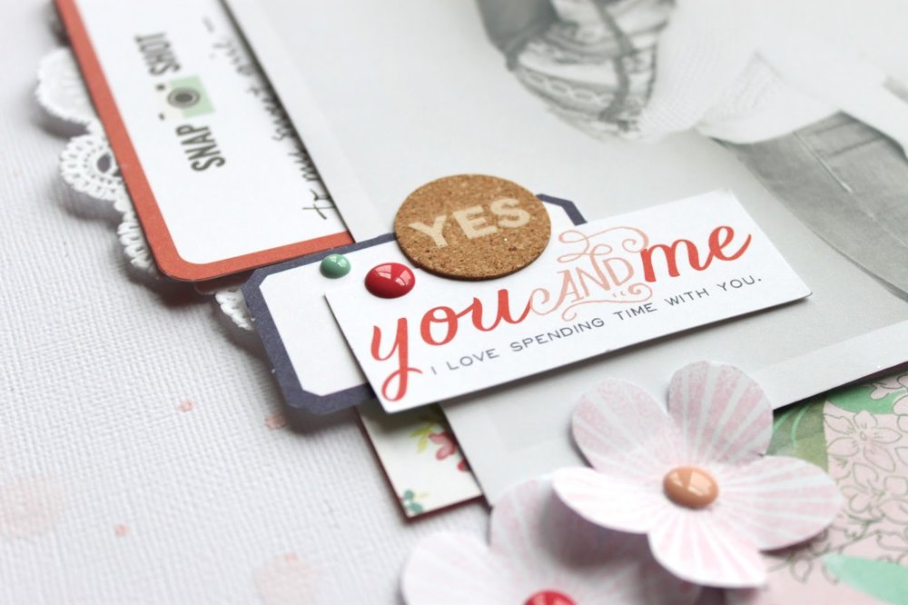
For this photo, I started with a vertical band of papers on the right side of my white background.  To keep it girly, I added a large white doily and a few stamped flowers inspired by this tutorial from Elizabeth Kartchner.  I also sewed a glassine bag underneath my photo so I could add my journaling onto a Project Life card and slip it into the bag.


So are you up for a challenge??  I'd love if you would play along!  After you post your project to your blog or gallery, add a link in the comments here!!  This challenge is open until next Monday, March 24th.  I'll post the winner to my blog and send out a fun little goodie bag!

Happy Monday and Happy St. Patrick's Day!!
xoxoxo
12 on the Twelfth: March Pictures


So February went by in a flash, huh?
On to March we go...

The 12th kind of snuck up on me this month.  It fell on an absolutely "ordinary" day for us.  No snow, no school closing...nothing out of the ordinary.  I'm so happy that I finally go to capture a "normal" day.  

And once again, I'm so glad that I have chosen to do this project this year.  It's one more "thing" added to my plate, but it allows me to see our everyday as a whole....  It allows me to take a moment and reflect on what we do, who we are and what is most important.  It reminds me of how small and funny and silly our kids are.  And it reminds me to savor these moments because they are all too fleeting.  It gives me a little "push" to be more present in our day and not worry about all the small stuff (clean house, sparkly bathrooms, folded clothes).  

Here is a little glimpse of our day....

I switched back and forth between my iPhone and my Canon all day long.  It's much easier to snap photos with my iPhone, but I sure love the quality of my Canon.  Either way, it's a win-win because the moments are captured.


Did you play along this month?  
I'd love for you to link up below if you did!  And feel free to link up whenever!  Don't feel like you missed out on the 12th!  Take yours on the 13th or 14th....do what works for you!!

xoxo


Project Life: February 2014

A quick recap of my February spreads in my Project Life album.  I'm still completing way more spreads each month since switching to the monthly approach.   And my spreads are usually comprised of a day or a "week", but the pressure of making sure I have enough pictures each week is off and I still love that.  I do find myself not taking as many photos with my big camera as I would like.  Hoping the warmer weather and sunshine will help that some.  

These first two spreads were put together using the March kits from Gossamer Blue.  The colors this month are amazing and it really got me in spring mood!!  

This spread includes one trimmed page protector (which has three 3x4 slots) and Design F.  I love the cohesiveness of all 3x4 pockets.


Design A spread.


These next PL spreads were created for Two Peas.  I've linked up the video for each of them if you were interested in seeing my process.  The products used can also be found on the main page of each spread.

This spread is all about me and my favorites right now!  It was really fun to include a page all about myself (something I very rarely do even in traditional scrapbooking).  This is more like an insert since it's front and back.  I used a baseball card protector for this insert.  I do love the smaller size (roughly 2.75x3.75). 


Simple Design A here.  Lots of photos and words.  

This spread includes one Design A and a front and back of Design E.  I included full 6x6 photos of my kids, as well as some journaling and current favorites on the pocket.  You can see the process video here at Two Peas.

Click the above link for more information, as well as a quick tutorial for printing photo collages using Picmonkey!


So how's your Project Life coming for 2014? Are you loving your plan or feeling stuck?  I swear by the monthly approach (for me).  I love creating without the stress of feeling behind or the need to be caught up.  There's nothing like "I really need to do this" to make me feel like NOT doing it, you know!!


Oh happy day...

This month at write.click.scrapbook is mini madness March and it just 
happens to be my favorite month ever!  I put together a fun mini album using a 
variety papers from the March Gossamer Blue kits, including the speciality papers.  
You can see a quick little video of these papers in action on my blog earlier this week.

(Warning....picture overload here)

I used the Silhouette to cut out my title.  I love the peek-a-boo effect!

The papers are various sizes throughout the book.  
I just randomly trimmed papers from the March kits and then added in my 
photos, journaling and paper layers.  I was going for a "messy" look for this one.


I also added trimmed papers and journaling cards onto one ring.  
I wanted movements and random bits of papers throughout the book.

For this page, I wanted to include two photos of my children, 
and wanted it to sort of interactive.  To create a flap, I trimmed my paper a bit 
larger than my photos and then scored my paper right outside my photos.  
Super easy and super fun!

I did something similar here, but created a pocket instead of a flap.  
The pocket holds a photo and some journaling to my daughter.


The colors and papers from the March Gossamer Blue kits are amazing.  
They have me longing for springtime, sunny days and warmer weather!!  
Unfortunately it's rainy and brrrrrr cold today.  Boo. 

Happy Friday!
xoxo

crate paper: captured


Today, I wanted share a fun layout I put together using the Crate Paper Styleboard collection! 
This collection had so many awesome elements and  papers and I wanted to highlight some of my faves using various punched circles, circular photos, flair and embellishments! 


I love these photos of my children. And I love how masking the photos into a circular shapes draws your eye into the photos.  I used Photoshop Elements to create these photos.  For a quick tutorial...check out this post. Instead of drawing hexagons, you will want to draw circles. Otherwise, it's the same!


To continue the shape around my page, I punched circles from a few papers and added in additional circular elements! I added several clusters around my page, but kept them roughly in a group of three keeping the composition within a visual triangle.


I typed my journaling onto vellum and layered it over a  patterned paper to add a little color while still maintaining the transparency of the vellum.

I'm really digging masking my photos into shapes recently!! What about you?? Have you tried  this technique yet!?