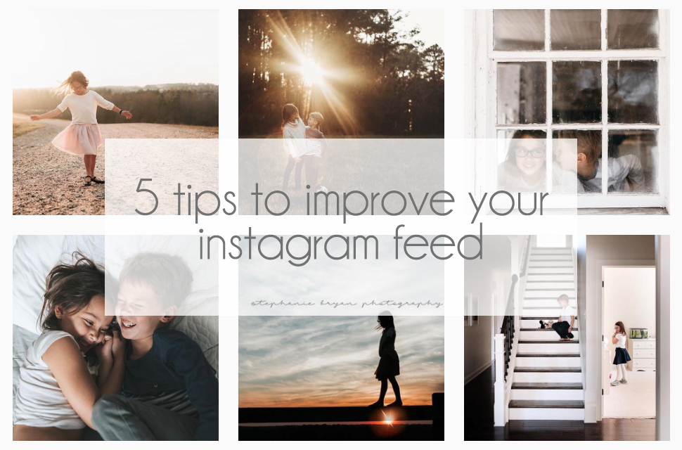
Since 2009, I have been a BIG fan of Instagram. I love the IG community and the wonderful artists and mamas I've met along the way. I make it a point to get on a few times each day and try to post at least 4-5 times a week as my schedule allows. There's really no "secret" when it comes to creating an attractive Instagram feed, but these are some things I have worked on over the years for a cohesive feed. (And just FYI - I by NO MEANS think my Instagram feed "stands out" or is perfect. These are just my thoughts!)
1. Plan ahead and organize your photos
I am probably a little too obsessed with my Instagram feed. I LOVE a good grid of photos in general, so I always like to see how my photos will look with the rest of my feed. There are tons of tools available these days for planning and organizing your Instagram feed and if you're wanting to up your Instagram game, then I totally recommend checking them out! My favorite is the Snug app, which is free in the Apple store. It allows you to add/remove/rearrange photos as much as you like. It does not schedule your photos for you, which is totally fine with me. Planoly is another good planning tool, which allows you to both organize/arrange your photos, as well as schedule them on a calendar with a reminder. You can access Planoly from your computer, so if you have all your photos on your desktop, that might come in handy. The basic organizer with Planoly is free, but there are options for upgrades.
2. Stay consistent in your editing
Instagram feeds that "stand out" are usually pretty cohesive in colors, tones and style. In general I try to stay pretty consistent in my editing style, so my colors and tones are usually pretty much the same (ex. I like my blues a little more green than blue; I prefer my greens a little desaturated, etc...). If you're consistent in your editing, then the overall feel of your Instagram feed with be consistent. It will be true to your style and editing techniques, which will help brand you and your images!
3. Balance colors and whites
If you scroll back through my feed, you will see that I try to have a good mix of light and dark photos. I frequently use the planning tools mentioned above to make sure there is a good balance of colors/whites throughout my feed. I try to pay attention to how images will look in a row, as well as how they look stacked on the image below. Weird, I know, but I like a good consistent feed and it's kind of become my guilty pleasure.
If you scroll WAAAAAY back in my feed, you will see my "I love everything white and bright" stage (also the stage where I photographed my kids against every white wall I saw....). I was consistent with my love for everything white, but over the years, I fell in love with rich tones, golden flares and more. Now, I try to mix in a little of both so the grid of photos stays cohesive, but also true to my current style.
4. Mix in a variety of angles and perspectives
Just like colors and whites, be sure to vary your angles and perspective for interest. Shoot from above, fill the entire frame with your subject or use a middle composition. Give your "viewers" something different and unique to look at as they scroll through your feed.
5. Delete it if it doesn't work
Delete, delete, delete! If it doesn't look right or it bothers me, I delete it. I obviously still have the image on my camera or computer, so it's not like it's actually gone, but if it doesn't jive with my feed, it's a goner. I am very selective about the photos I post and I love to tell a story with my feed and I don't feel bad one bit if I decide to delete a photo! It's your feed! Own it!
looking for more tips + inspiration?
follow on Instagram
