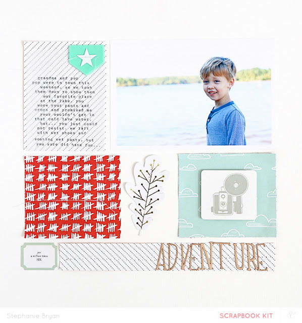
I keep coming back to a grid design. I think it's because it's just easy to do, but can vary so much with different sized photos, papers, embellishments, etc...
For this layout, I started with a 4x6 photo of my son and then built the grid around the photo. It's fun to cut and paste and really create without any set parameters.
This page came together SO easily, which just reaffirms my love for a grid or collage.
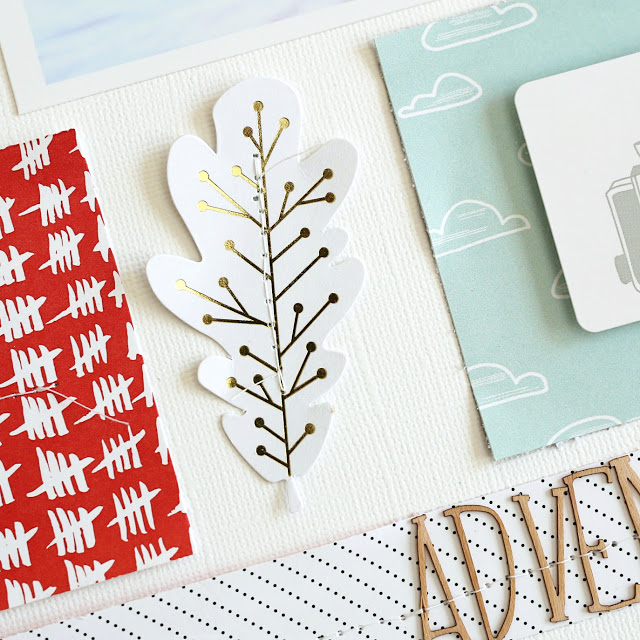
I broke up the papers and patterns a little by adding in a leaf embellishment from the Studio Calico Canyonland Scrapbook main kit and also added in a little wood veneer alpha for texture along the bottom strip of paper. I've said it a zillion times before, but it's the simple embellishments that add so much impact to me!


