I had so much fun putting together these Project Life spreads this month. I used the awesome May Gossamer Blue kits and the designs and colors were just perfect for this time of year!!
I wanted to do something different and definitely mixed things up for me. Breaking out of that "design A" mold from last year has been the best thing for me. I love being able to think outside the box and get creative. Don't get me wrong, though! I'm still a big fan of Design A and frequently find myself floating back to it when I put my spreads together.
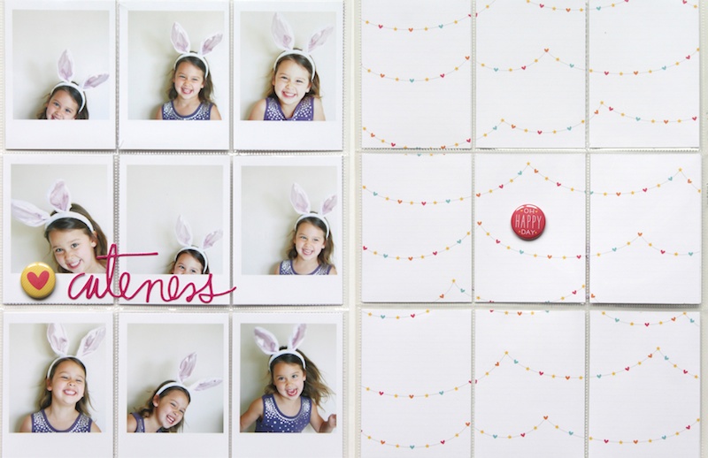
For this first spread, I really wanted to use all of these photos of my daughter. We were playing around with her rabbit ears one day and snapped a bunch of cute bunny photos of her. Every single images makes me smile and I couldn't imagine trying to pick just one.
I printed the photos to look like Polaroid images and then added them to the front side of a Design F page protector. This page protector has ten 3x4 slots and one 4x6 slot. I trimmed off the far right side and then sewed the 4x6 slot down the middle to give me twelve 3x4 spaces. I didn't add many embellishments because I wanted the photos to speak for themselves, but I couldn't resist the Heidi Swapp "cuteness" script sticker and a heart flair button!!
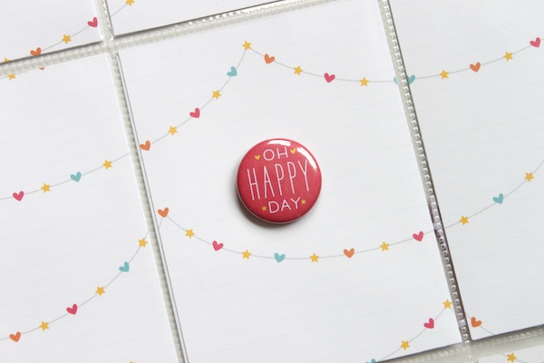
Since the front side was pretty photo heavy, I decided to stick with a neutral, simple back page. I used a piece of patterned paper from the Gossamer Blue kits and trimmed the 12x12 page down to 3x4 cards. Then I slipped them behind my photos and added a small flair to the middle of the page.
This spread was inspired by Elisa Cripe's 2014 title page. I loved the way she incorporated triangles into her spread and have been waiting for the perfect photos and journaling cards to try this technique. This was quite a labor intensive spread, but I do love the way it turned out!!
I started by designing a 3x4 photo card in Photoshop that had two triangular layers for my photos. Once they were printed, I trimmed them out and then chose a few of my favorite Gossamer journaling cards from this month! The cards in the Gossamer Blue Life Pages kit had the perfect orientation of phrases/colors/designs to trim them on a diagonal.
I left a few photos empty and added some sequins and stickers. I love that transparent effect throughout my book!
So fun!!
I have one additional Project Life spread that I made with the May Gossamer kits! It's a fun tutorial and I can't wait to share!
Happy Thursday!!


