Making Time
Sometimes life gets so busy that we really have to "make time" to do things. As I've gotten older (and busier), I've learned that I really do have to make the time. I try to make time for running and exercise. If I don't make the time, it's not going to happen. I have to make the time for date nights and getaways....these things aren't happening on their own! And I have to make the time to be creative. Creating is something that I love, but let's be honest, sometimes life gets in the way of sitting down and making something. And sometimes a busy life = a busy mind and slowing a busy mind is as challenging as slowing a busy life, right???
When I sat down and created these layouts, I literally was "making time" to do just that. There are a zillion other things that I probably should have been doing (hello December), but creating something with paper was what I really wanted to be doing. So I made the time. And it was awesome. It took me a while to switch my mind into creative mode (I don't think I've made a layout in months!!!), but once I got there, I felt the groove. That "groovy feeling" is why I usually create several pages at once....the first page is usually the most challenging, but then the ideas flow much easier after one page is finished. It's like cutting that first piece of paper from a kit....I approach that with such anxiety for some reason....like I'm going to ruin something or mess something up!
These two layouts below are my "make the time" layouts. I used up the leftovers from my
Studio Calico Park Avenue Scrapbook and
Project Life kits to create these pages. The scraps and the odds and ends of leftover kits are my favorite, I think!! (I guess it goes back to that feeling of maybe ruining something at the beginning of the process!!)
I started this first page with the two photos and a story. I'm really trying to be more purposeful with my pages this year. I always say that I don't tell enough stories in my pages (and Project Life), so I'm focusing on improving that with this next year. Every photo tells some type of story. I just need to get in the habit of making that a priority rather than just including the details.
I played around with the placement of my photos, but in the end decided to stack them on top of one another and include my journaling underneath. Visually, I think your eyes are drawn to the photos, but the words are still right there waiting to be read. I kept my embellishments pretty simple and added in chipboard frame, diamond stickers and small badge.
I used some white alpha to spell out my title along the bottom. I didn't want something heavy and distracting at the bottom of the page, so I felt like the white-on-white contrast was a good fit.
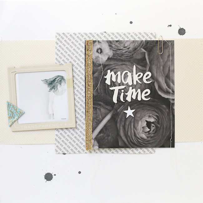
I created this second page with the idea of "making time" in my head. Most of my pages are about my children, and just like telling stories, I'm trying to incorporate more of "myself" in my pages. I try to think of it like keeping a diary or writing a journal. These pages are little pep talks to myself.
I was immediately drawn to moody and dramatic
black & white floral paper from the Park Avenue kit. I feel like I struggle with rocking darker papers, but I just loved this one so much that I had to find a way to make it work.
I began by adding the a title to the front using the same (Amy Tan) alpha that I used on the page above (already had them out and handy, so why not??). :) The contrast between the alpha and paper really worked for me. It brought in some of the whites of the page and help tone down the darker paper.
I kept the remaining layers very simple and neutral by using lighter colors and smaller patterns.
For my "story", I wrote down my thoughts on making time for myself and the things I want most in my life. I just used a plain piece of white card stock I had sitting on my table and then added a few number stamps and star stamps on the page. Pretty simple.
I adhered the journaling page to my paper layers and then sewed the black & white floral paper along the right hand side to create a lift up flap.
To finish this page, I added a photo of myself in a chipboard frame and included a small triangle chipboard piece next to it.
So, the "take away" from these pages is to make time! Make time for yo' self and what you want! Make time to create and have fun and be you. There's no better you than you!
And to help you get all the supplies you need to make time to create, Studio Calico is offering up an awesome Christmas deal!! If you have been on the fence about
subscribing to Studio Calico, now is your chance!! Right now they have an awesome promo where you receive a
FREE ADD-ON if you start a new subscription (promo code: DEC14SUB)! I created the two layouts you see above, my
Barcelona mini album and TWO Project Life spreads (which I will be sharing soon) with just two kits!! I swear their kits are jam-packed and last foooooorever!! So.....hurry on over and sign on up!


